
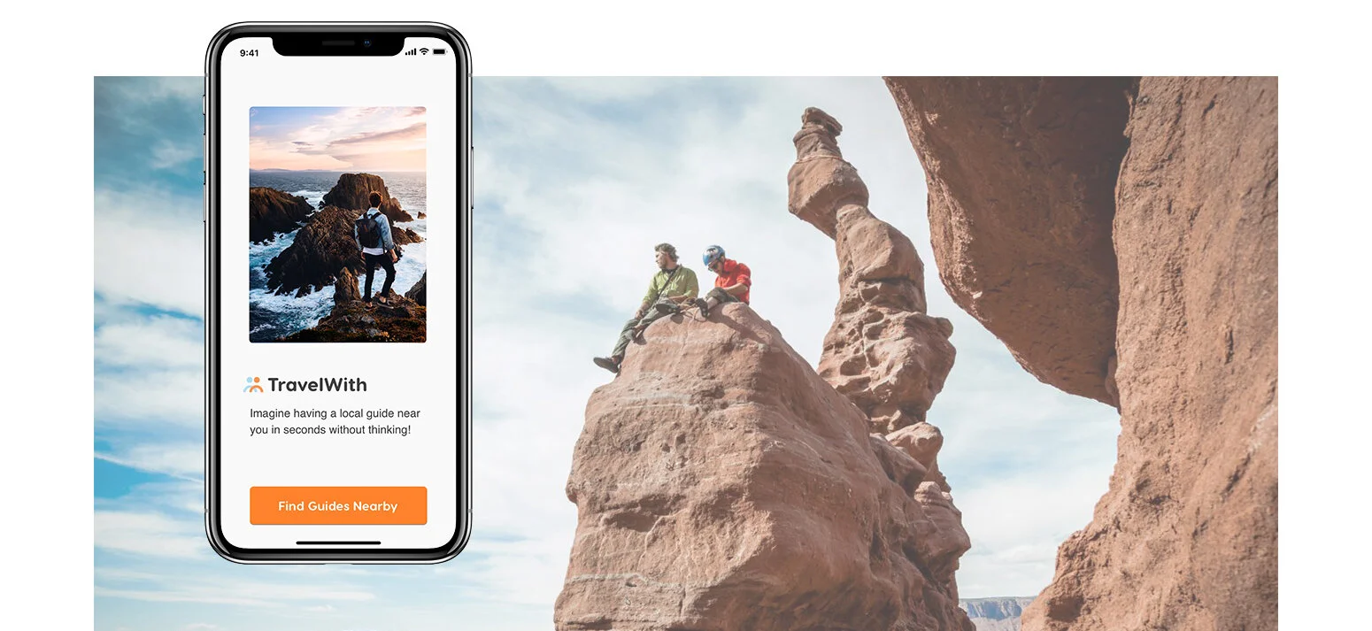
TravelWith is the perfect app to help last-minute travelers find authentic experiences.
Problem
Millennial travelers don’t spend enough time planning their trips while they want to have authentic travel experiences and connect to local people.
Hypothesis
Develop an app that provides authentic travel experiences by local people based on traveler’s location and preference.
Process
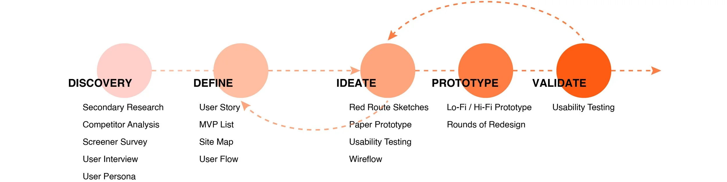
1. Discovery
Secondary Research
To determine if there is a market for a travel experience app, I conducted secondary research. And I found out it is a trend that millennial travelers plan the trip on the go and prefer spending money on authentic and unique travel experiences.
Competitive Research
GOAL: Decide if there is a market for a travel experience app, and identify the issues and opportunities that exist in the similar apps on the market, which allows me to pinpoint the features that my app should include and differentiate my app from the existing ones.
HEURISTIC EVALUATION
I downloaded each competitor app (Withlocals, Airbnb, Eatwith and Showaround) and took notes on its usability, layout, navigation structure, compatibility, and calls to action. From this, I could create actionable points on how to position my app in the market and how to outperform competitors.
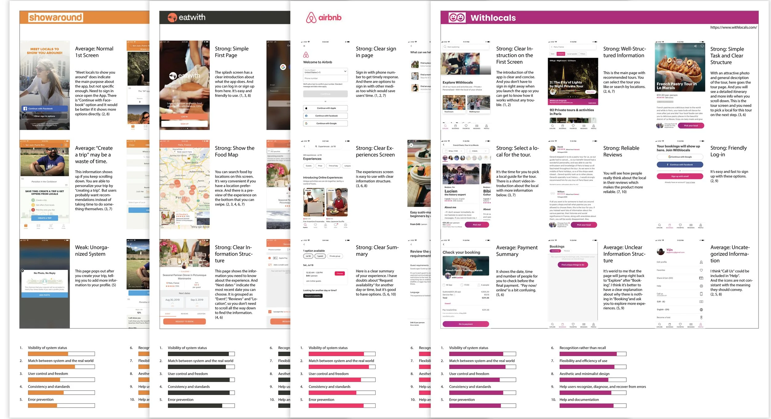
TAKEAWAYS: During this process I discovered I could differentiate myself from competitors by offering users:
A customized home screen - so users could find exactly what they're looking for more quickly.
A cleaner user interface - so users won’t be distracted with irrelevant information.
A more efficient way to introduce the experience - so users could make decisions more easily.
A simpler flow - so users could achieve their goals more efficiently.
Personalized recommendations - so users could find the ideal experiences for their preferred activities.
Primary Research
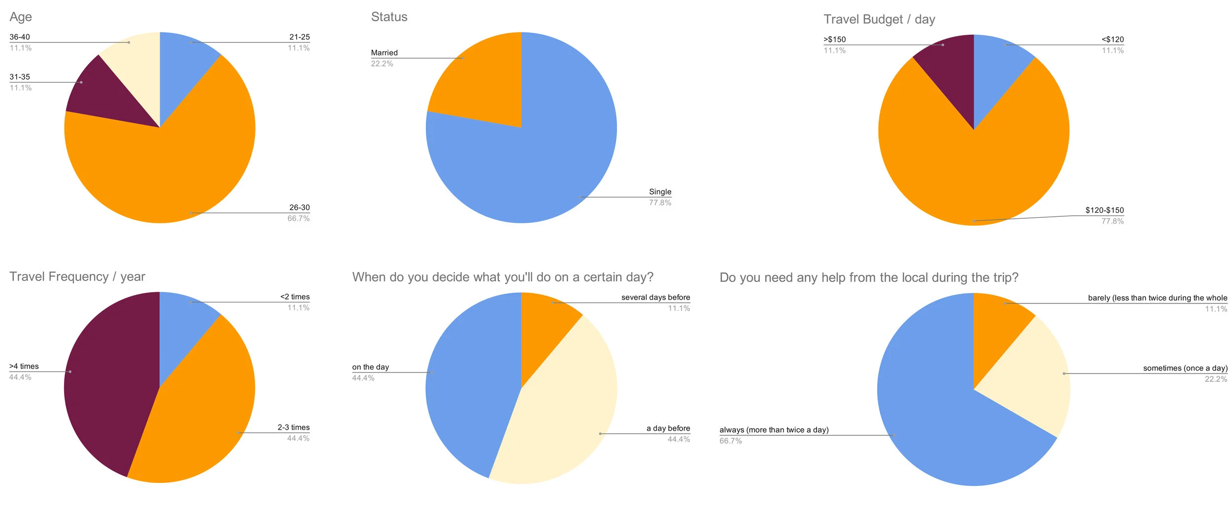
After these initial researches, I designed a SCREENER SURVEY to ensure there is a market and to ensure my research is built on insights from ideal participants.
The charts below show crucial questions from the screener survey. the analysis demonstrates again that there is a market to provide authentic experience to last minute travelers. I selected 5 participants out of 9 who filled out the screener survey as ideal participants to conduct interviews later.
And then I conducted INTERVIEWS with participants selected from the screener survey. The goal is to investigate what are the likes and dislikes about their current methods of finding experiences. I'd like to learn what are the most frustrating things during the whole process and how I can improve their experience.
Below are some INTERVIEW HIGHLIGHTS. (Interviewed 5 people, each person about 30-45 mins)
“I love discovering places that only the local knows!“
“Why should I pay the local instead of visiting myself? Why are they qualified?“
“I want to view experiences and make a decision quickly like using a dating app.“
I like watching YouTube videos to get to know a person or an experience.”
TAKEAWAYS: After conducting user research I found the 4 major requirements I needed for my MVP were:
Video introduction with detailed information about the local guide and the experience - which is the most important reason that the users will use the product.
Quick selecting system that allows users to view one experience at a time and click to view the next one, just like using dating apps.
Location-aware that helps users view experiences near them.
Machine learning to recommend experiences based on the users’ preferences.
User Persona
GOAL: Analyzed the data from the findings, I created 3 PERSONAS that could help me better understand how users may use the features in my app and how they achieve their goals and solve their problems.
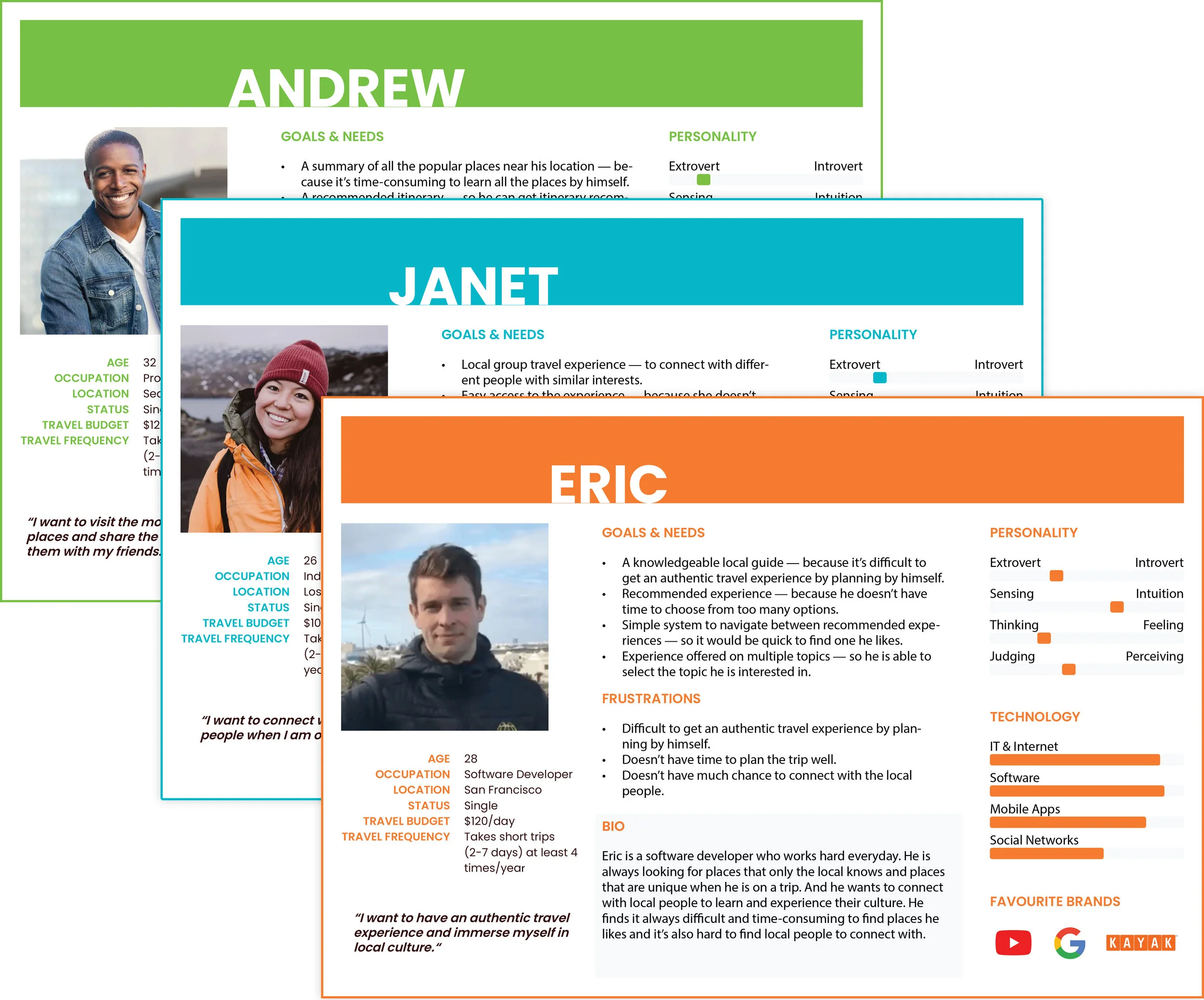
TAKEAWAYS: After creating the 3 personas I had a clearer sense about the demographic of my potential users and their similarities: they don’t have time to plan the trip well while want good experiences to make the most of their vacation.
2. Define
The discovery part allows me to understand the goals and the major pain points. Elaborating the data obtained and comparing to the similar products available on the market helped me create USER STORIES and refined the MVP LIST.
MVP List
As a last minute traveler who desires an authentic travel experience and want to connect with local people, "I" want a knowledgeable local guide to show me the places “I” am interested in so that "I" can get the experience I want without spending time looking for it.
Get experience recommendations base on current location
Search for experience on other locations
Check experience details
Create an account
Pay for the experience
Connect with the experience host — a local guide.
TAKEAWAYS: Making an MVP list helped me narrow down my design directions and organize the content in the app. After the MVP study, I decided to focus on the primary persona “Eric“ to design the app and leave the other 2 for future development.
Then, I developed an INITIAL SITE MAP to explore the site navigation and organize content in an easy-to-use way.
I also created INITIAL USER FLOWS to help me understand how users complete the key tasks on this app. I wanted to reduce distractions so that users can focus more on the tasks to achieve their goals.
3. Ideation | Prototype | Validation
Paper Prototype
GOAL: I sketched THE RED ROUTES of this app to easily communicate my ideas with stakeholders and potential users, and to get more feedback to refine the design.
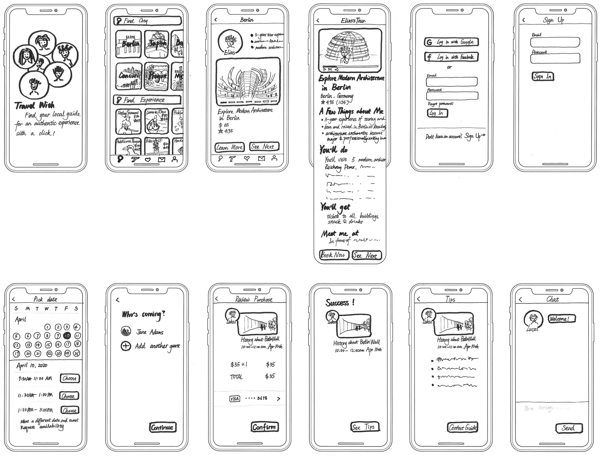
TAKEAWAYS: I started out using pen and paper to create sketches of the flow. I became more comfortable with hand-sketching after practicing. I learned it’s important to show the flow, the content and the atmosphere in the prototype while following human interface guidelines. This prototyping was quick, inexpensive, and allowed me to focus on high-level functionality.
Usability Testing
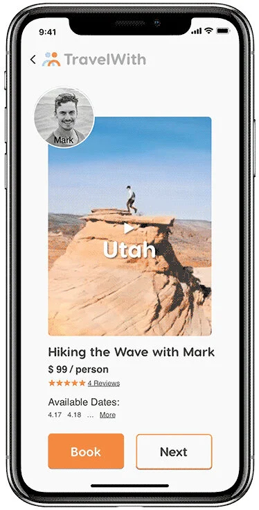
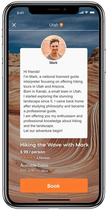
GOAL: To use this quick, cost-effective way to learn what users like about this design and what aspects of this design are less intuitive. And I want to test the efficiency of the introductory video which includes THE EXPERIENCE OVERVIEW, THE LOCAL GUIDE’S PITCH. And the length of the video should be LESS THAN 2 MINUTES. I showed an exemplar (as shown below) with the paper prototype in the usability testing.
KEY FINDINGS:
100% of the participants thought the video introduction is an efficient way to introduce the experience and the local guide.
For a recommended tour, 80% of the participants thought having images on the first page and video on the second page is repetitive.
80% of the participants pointed out it would be convenient for last minute travelers if it allows “search by current location“.
Based on these finding from testing, I've revised the SITE MAP and USER FLOWS to help myself better organize all the content and keep all key tasks smooth and clean. It also helped me verify if the solution's process was viable.
Wireflow
GOAL: To show clearly the Lo-Fi screens and the user flows and lays the foundation for the Hi-Fi prototype later.
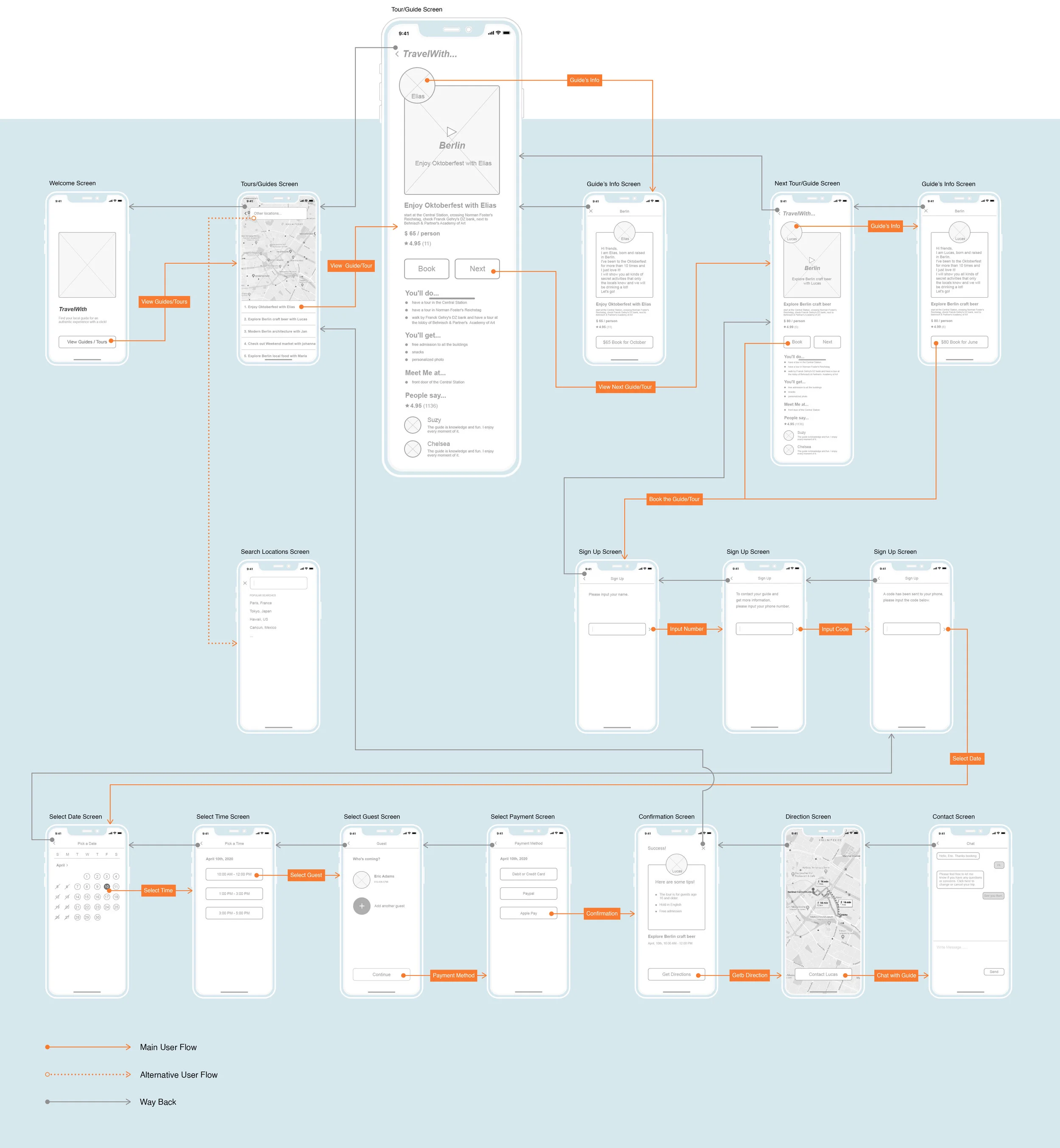
TAKEAWAYS: I built the Lo-Fi wireframes using Adobe XD at first, but I found out it’s difficult to insert videos to Adobe XD. So I switched to Sketch and imported all the screens to Principle for Mac to insert the videos fluently. Selecting the right tools for your project at first will save your time.
UI Design
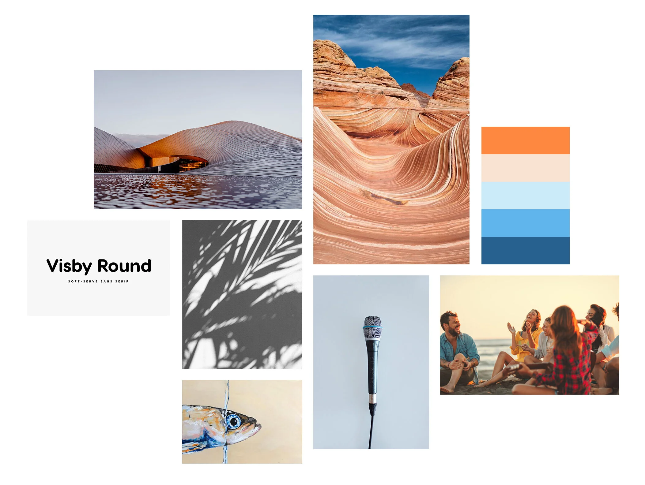
I created a MOOD BOARD to help me define my ideas and set the tone of this project.
Being a last minute traveler could be stressful. I aim to choose color and typography strategy wisely to relieve Eric’s stress. Blue colors can calm his mind and reduce his anxiety. And the complementary color orange could spur him forward. The typography “Visby Round“ speak with a soft tone of voice which is friendly and relaxing.
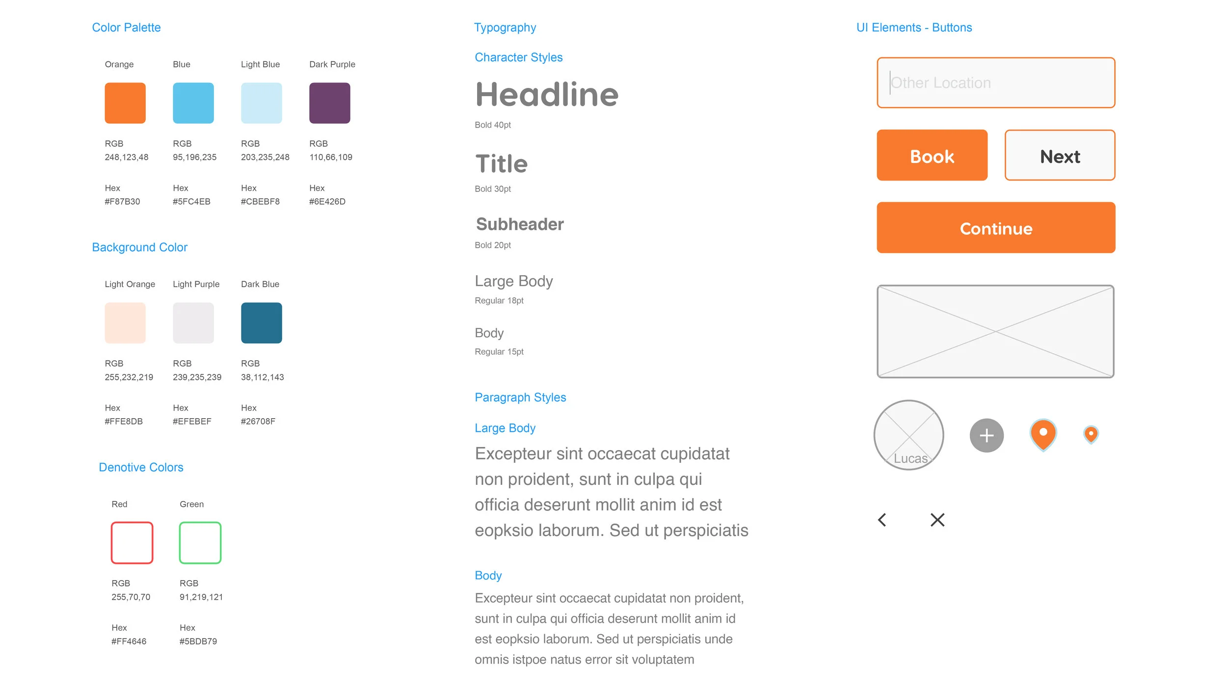
To create a unified look for this project, I designed a STYLE GUIDE and updated it consistently until I finished this whole project.
Prototype
GOAL: To effectively communicate the app's functionality, I used Sketch and Principle for Mac to make the high-fidelity designs interactive. I conducted rounds of usability testings using this prototype later.
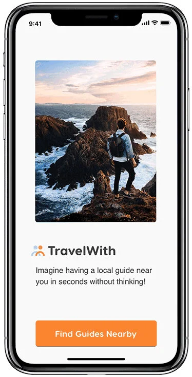
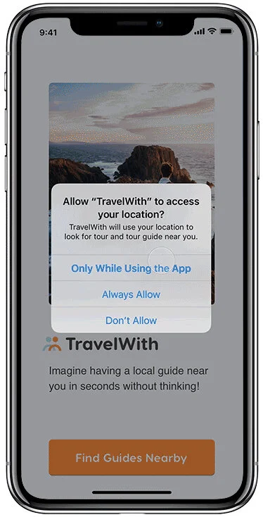
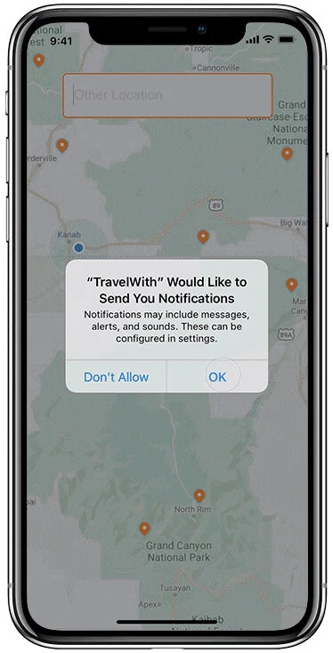
Home screen/Enable access to your location
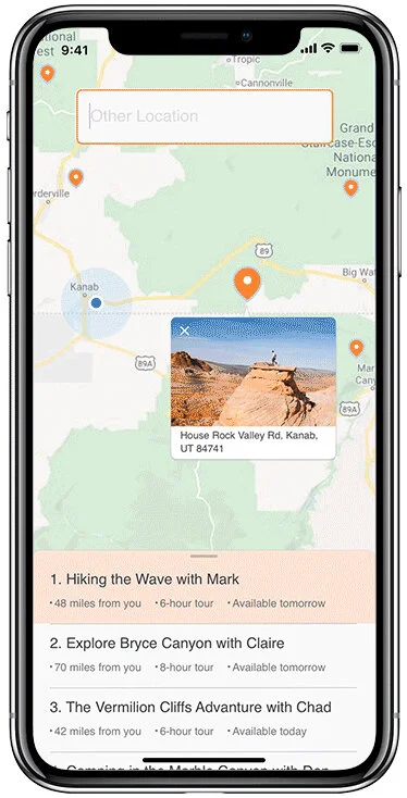
View recommended experience
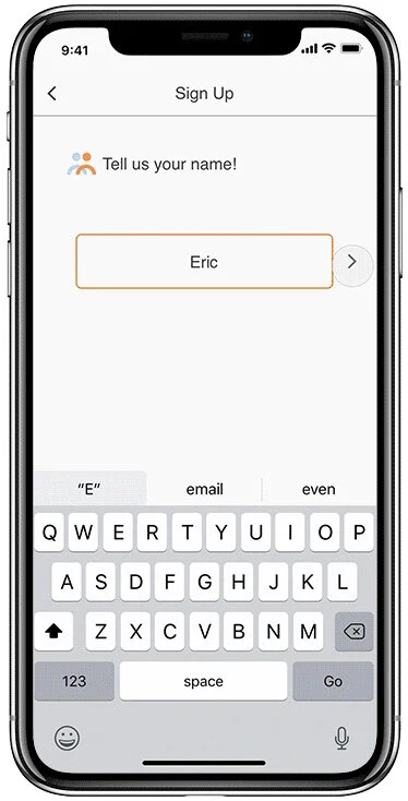
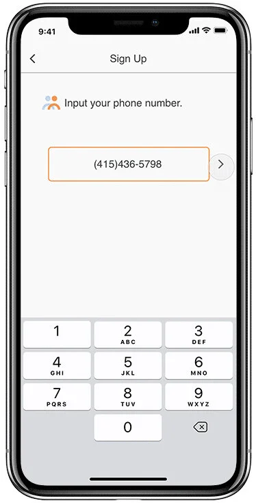
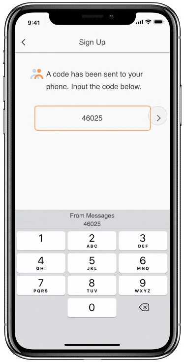
Sign up with phone number
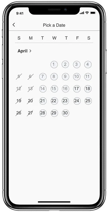
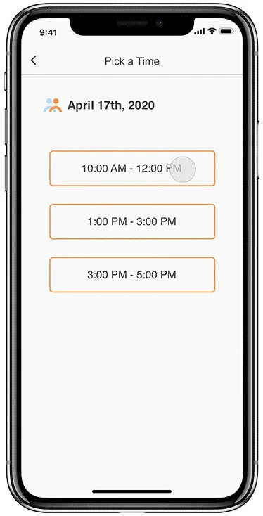
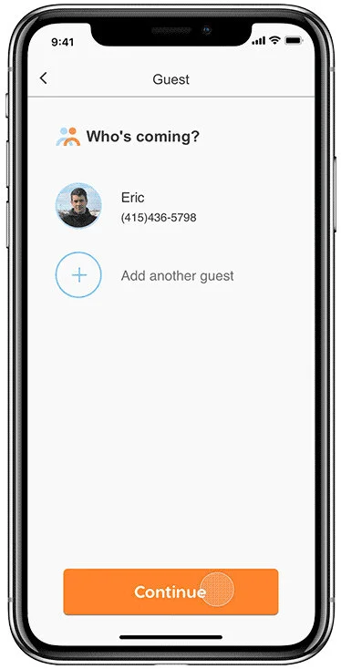
Confirm date/time/guest
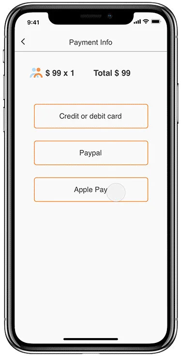
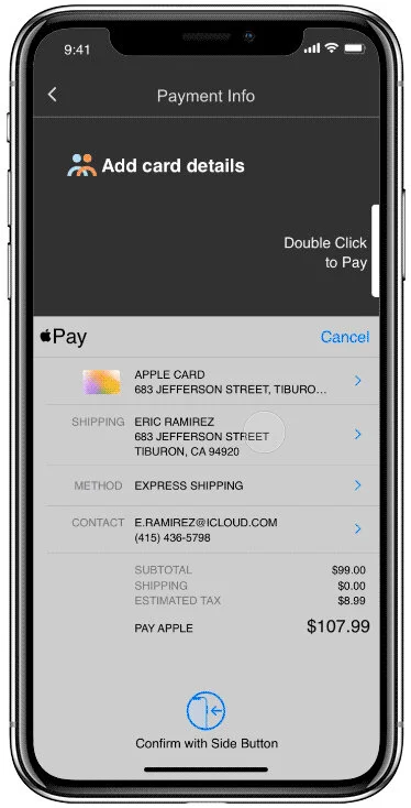

Payment info with Apple Pay
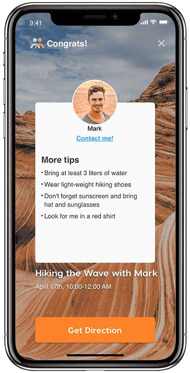
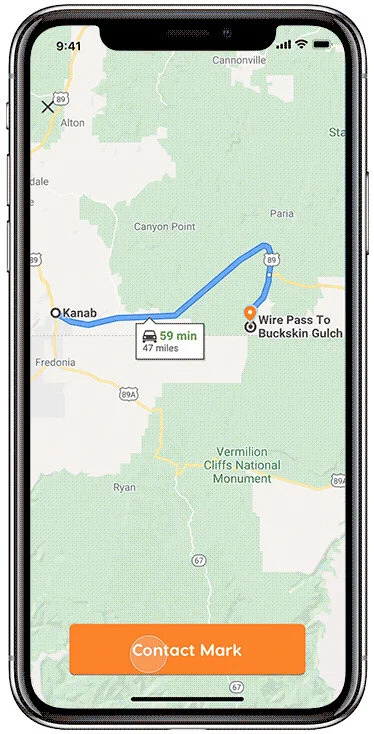
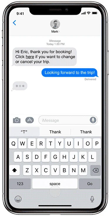
After payment
Usability Testing
After the Hi-Fidelity designs were created, I quickly realized that there were several UI issues that needed to be fixed. I fixed them and then I conducted 5 usability tests. These moderated usability tests I conducted remotely each lasted for about 30 minutes with participants who may NOT be potential users.
GOAL: Evaluate the ability of users to complete specific tasks while using the app.
FINDINGS:
80% of the participants thought the current prototype is more efficient than the last version.
100% of the participants successfully booked an experience they liked within 3 minutes.
80% of the participants clicked “Book“ right after watching the video without reading the written information, indicating that the video provides enough information for users to make a decision.
NEXT STEP:
I will conduct rounds of usability testings to refine the design.
I will work with software engineer to launch the app.
We will test the product on early customers and to get feedback for future product development.
Conclusion
Confirming my hypothesis through user research is essential.
Thinking myself as a user is not the same as interviewing a potential user. And what you think the users would do could be very wrong. That’s why the user testings are through the whole process of the design. Therefore, I only became completely confident in my hypothesis after I interviewed potential users.
Always question my design decisions to make better ones.
After completing this project, I realized that asking myself "Why does this need to exist?" or "What purpose does this serve?" is a valuable skill to have. Sometimes my design could be instantly improved by removing the unnecessary parts and simplifying the existing design. This made it easier for me to disagree and commit to my design decisions in front of key stakeholders.
Q&A
Thank you for reviewing my first personal project. Please feel free to reach out to me if you have any thoughts or questions.