
Design System for a Rapidly Scaling Startup
Role/Techniques
Component & Pattern Research
UX/UI Audit
Style Guide
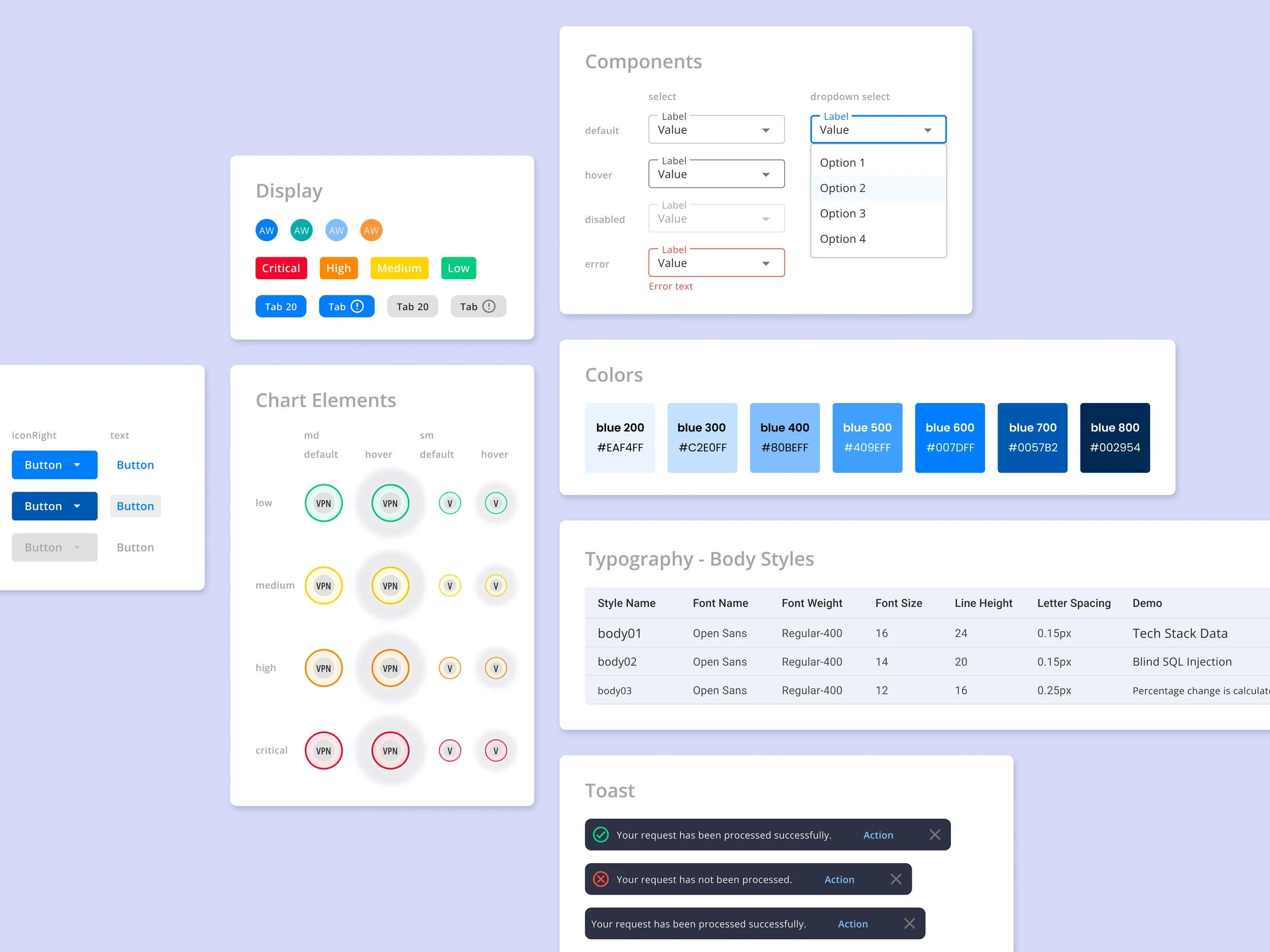
Component library
Component & Pattern Research
UX/UI Audit
Style Guide
Component library
Company/Team
OccamSec/Development Team
Front-End Engineer: Marlin Makori
The Problem
We started the MVP with Material UI to move quickly. However, as the product expands with more features, it’s hard to manage increasing complexity of the elements. And the communication gaps become larger between designers and developers. While we currently offer a web application, we also plan to create a mobile version in the future, which would be difficult without maintaining consistency.
The Outcome
Before
After
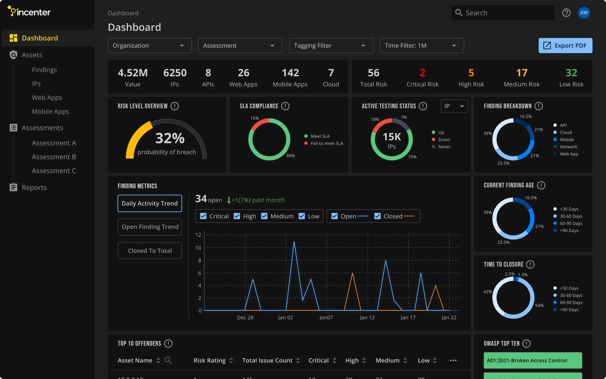
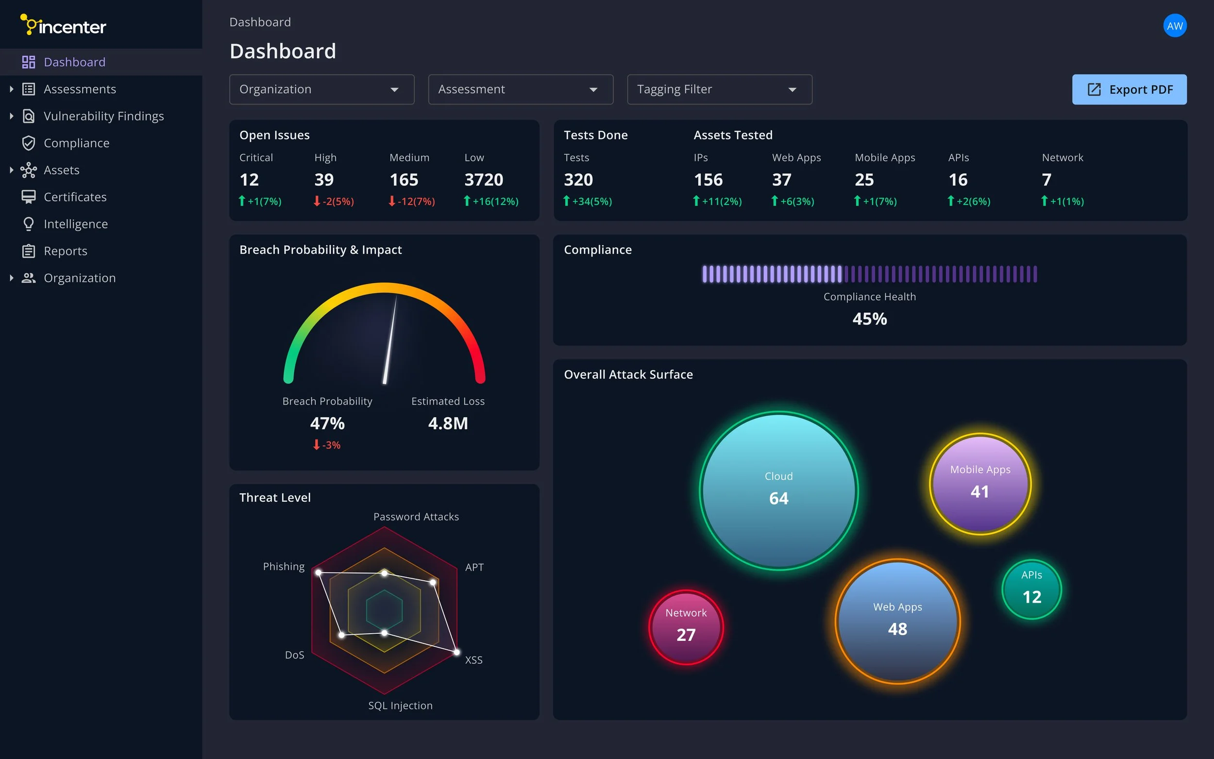
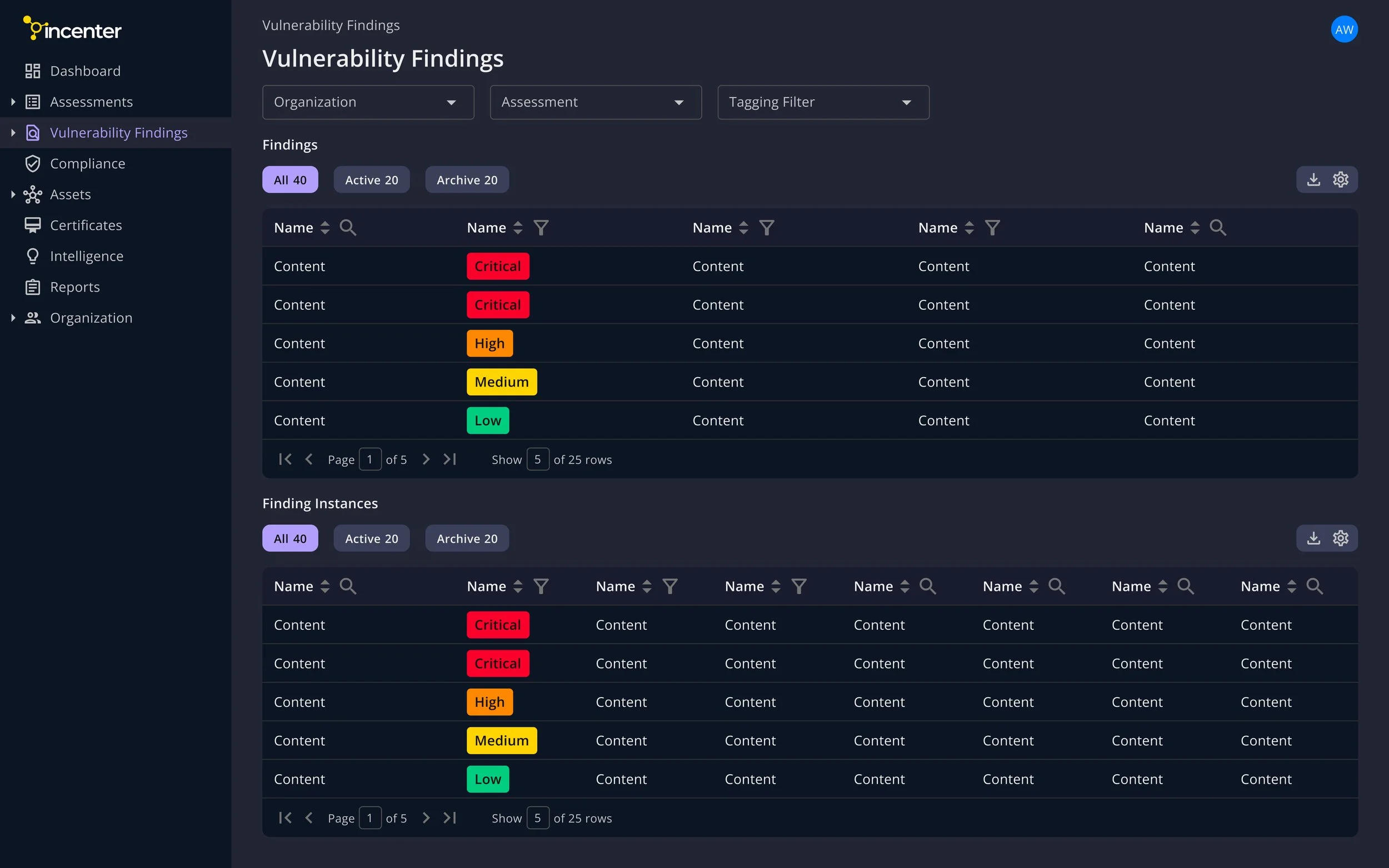
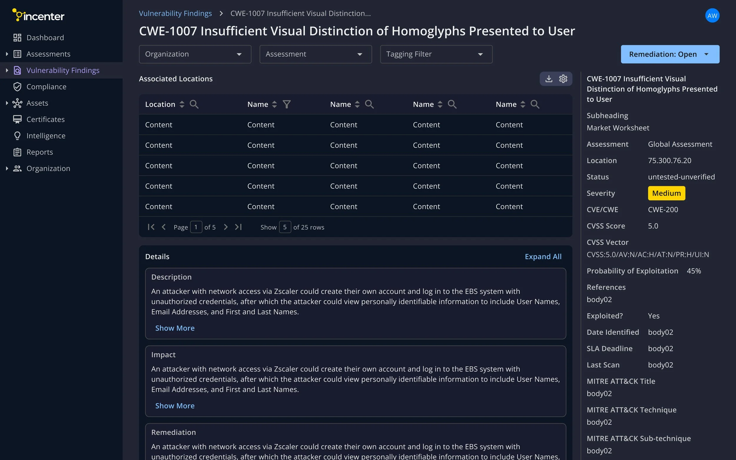
Dashboard
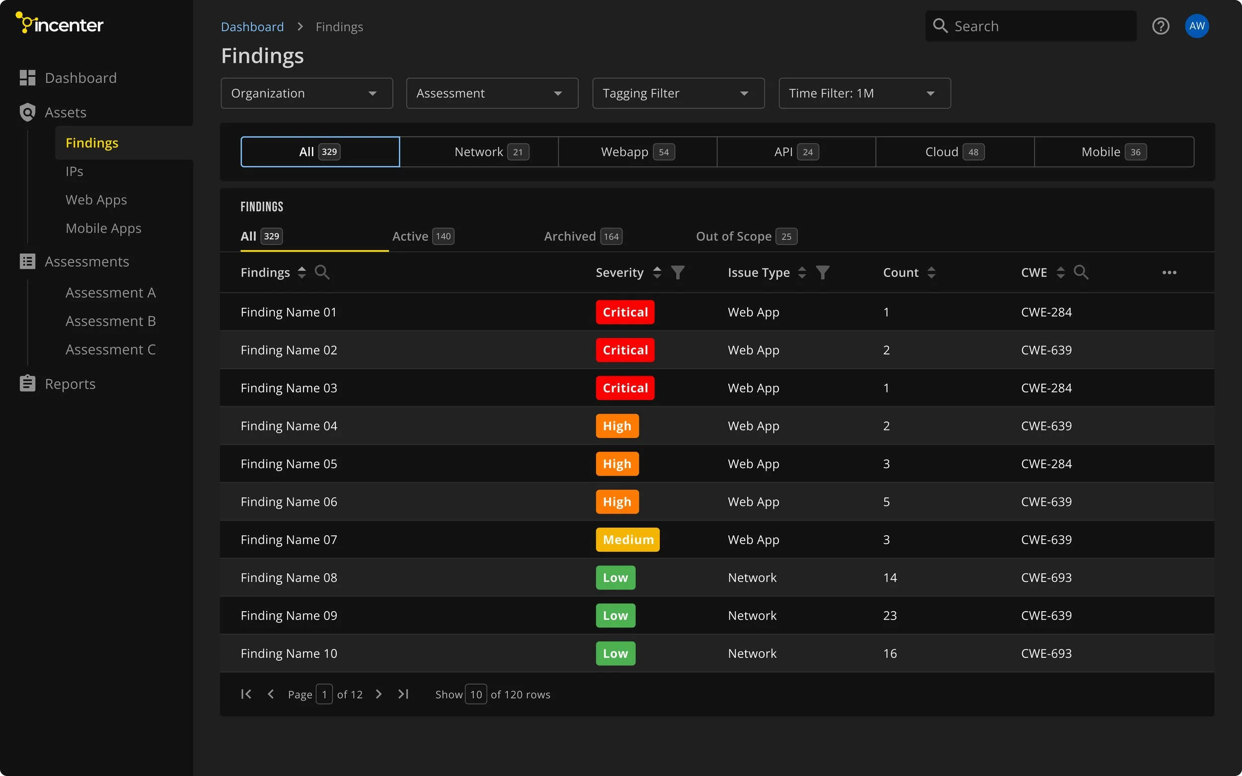
Vulnerability Finding
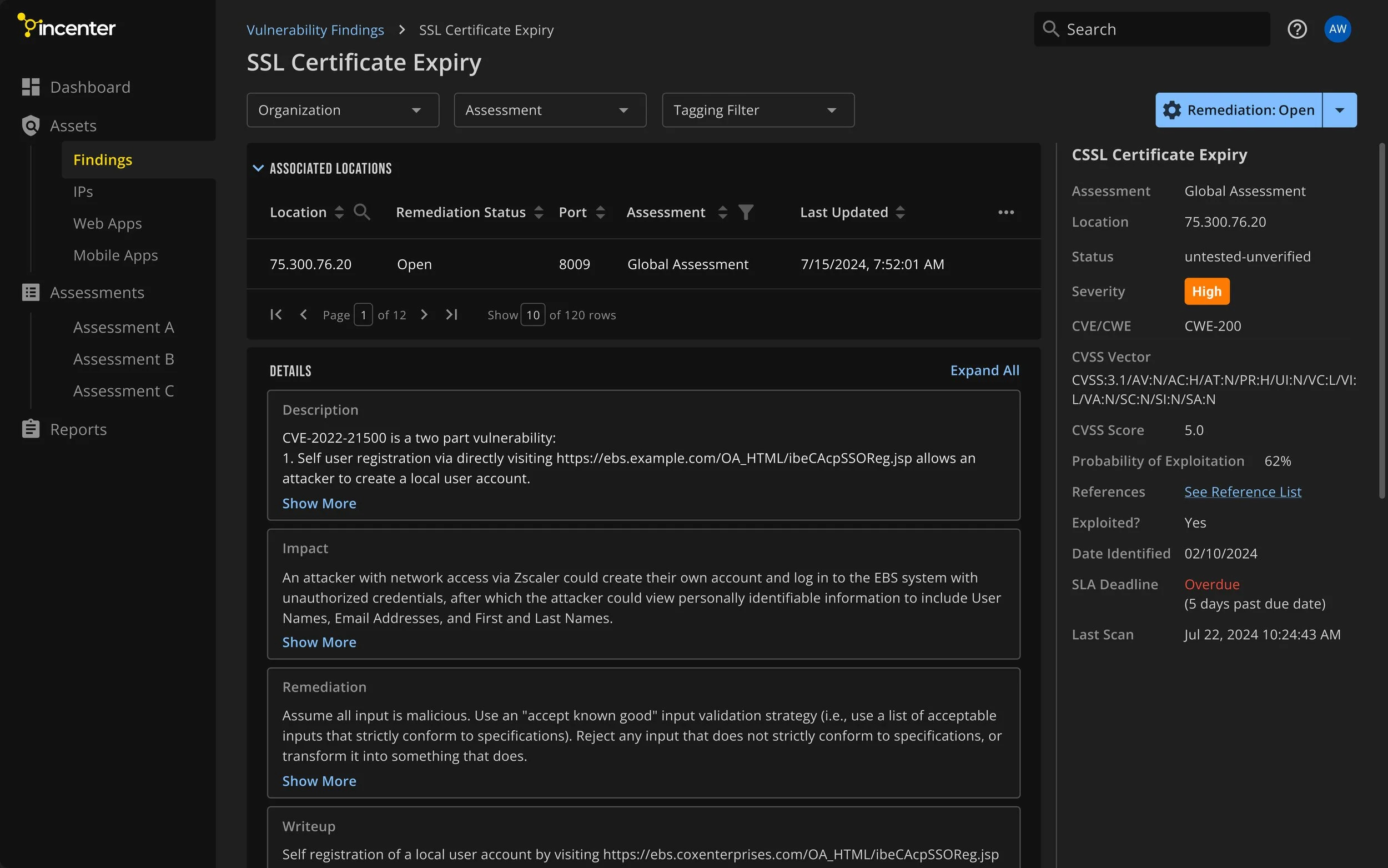
Finding Details
-
-
-
Details
Scope and Considerations
As the only designer, I had to juggle building the Design System while keeping up with fast-moving UX work. Since the system needed to scale quickly, I took a strategic approach—constantly refining and expanding the library as new use cases emerged.
We started with Material UI to get the MVP off the ground, and now we’re building a new Design System. While some elements from MUI are still being used, the new system is more focused on refining the design to better reflect our brand and deliver a more polished user experience.
Working closely with Front-End Engineers, I set both short-term and long-term priorities to balance speed and scalability. With tight deadlines, we focused on reusable components and templated layouts to keep things efficient and consistent.
More than just a set of components
Working with PM, we collect and analyze data from A/B testing and usability testing to learn users preference and trend.
I made sure the design system considers tricky situations, like long titles that might break layouts or empty states that leave users confused.
Foundations
I started by reviewing the existing elements in Figma, identifying gaps, and setting design principles to keep everything consistent. Then, I presented several design options to the Leadership team, aiming for a modern, vibrant brand while keeping user preferences and needs in mind. Once we aligned in a direction, I finalized the style guide, defining colors, typography, spacing, and grid.
When building the component library in Figma, I followed the atomic design approach—starting with basic elements like buttons, icons, and inputs (atoms), then combining them into forms and cards (molecules), and finally creating larger sections like navigation bars (organisms).
Accessibility
Ensure sufficient color contrast for readability, especially for users with visual impairments.
Keep layouts simple and intuitive for easy navigation by screen readers.
Size buttons and interactive elements for easy tapping and clicking.
Add clear labels and tooltips to images and technical terms for improved clarity.
Pragmatic creativity
When working on more complex screens, I sometimes needed to step outside the established guidelines to think creatively. This means both adding new components or re-evaluating existing patterns. It was crucial to find the right balance between sticking to the rules and introducing something fresh to improve the design.
Thorough Communication
To better communicate the design system to the team, I prepare below materials other than a set of components:
High-Fidelity Design Mockups: I organize all new components and their states using auto-layout and provide a link to the design system.
Interactive Prototype: I add a "Preview in prototype mode" link with instructions to the design showing how elements appear, come up, and dismiss.
Component Documentation: I include essential details for each new component, making it easy for engineers and teams to use them consistently. This speeds up the review and approval process and ensures a more efficient workflow.
Result
Even though we are still building out components, the impact has already been significant. Reusing styles and components has sped up the design process, and the workflow between design and development is now much more efficient. The dev team is very happy with the outcome.