
✈️ TSA but for Cybersecurity

As a cybersecurity company, we provide tailored solutions to protect clients' businesses. Our development team focuses on building a platform that helps enterprises understand their security landscape and implement effective solutions.
As the founding and sole product designer on a 5-person development team, I crafted an end-to-end user experience to help company users understand and address security challenges. The resulting design overhaul contributed to a 70% increase in the user base and a 62% rise in revenue.
In the startup setting, I led the entire design process, collaborating daily with product managers and developers. I built and implemented the design system in partnership with front-end developers. I also engaged closely with stakeholders to secure design buy-ins.
Company/Team
OSec/Dev Team
My Role
Founding Designer
Key Skills
User Research /Wireframing/ Prototyping/ UI Design/ UX Design/ Design System/ Stakeholder Management
Background
Penetration Testing Services
We’re a cybersecurity consulting company with a dedicated team that conducts penetration tests for clients. These tests uncover security gaps and provide actionable solutions. Before testing, we work with clients to define the scope; during testing, we share updates via email; and after testing, we deliver a detailed report with findings and recommendations.
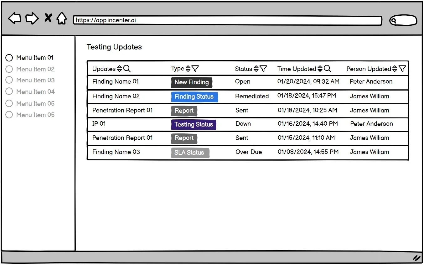
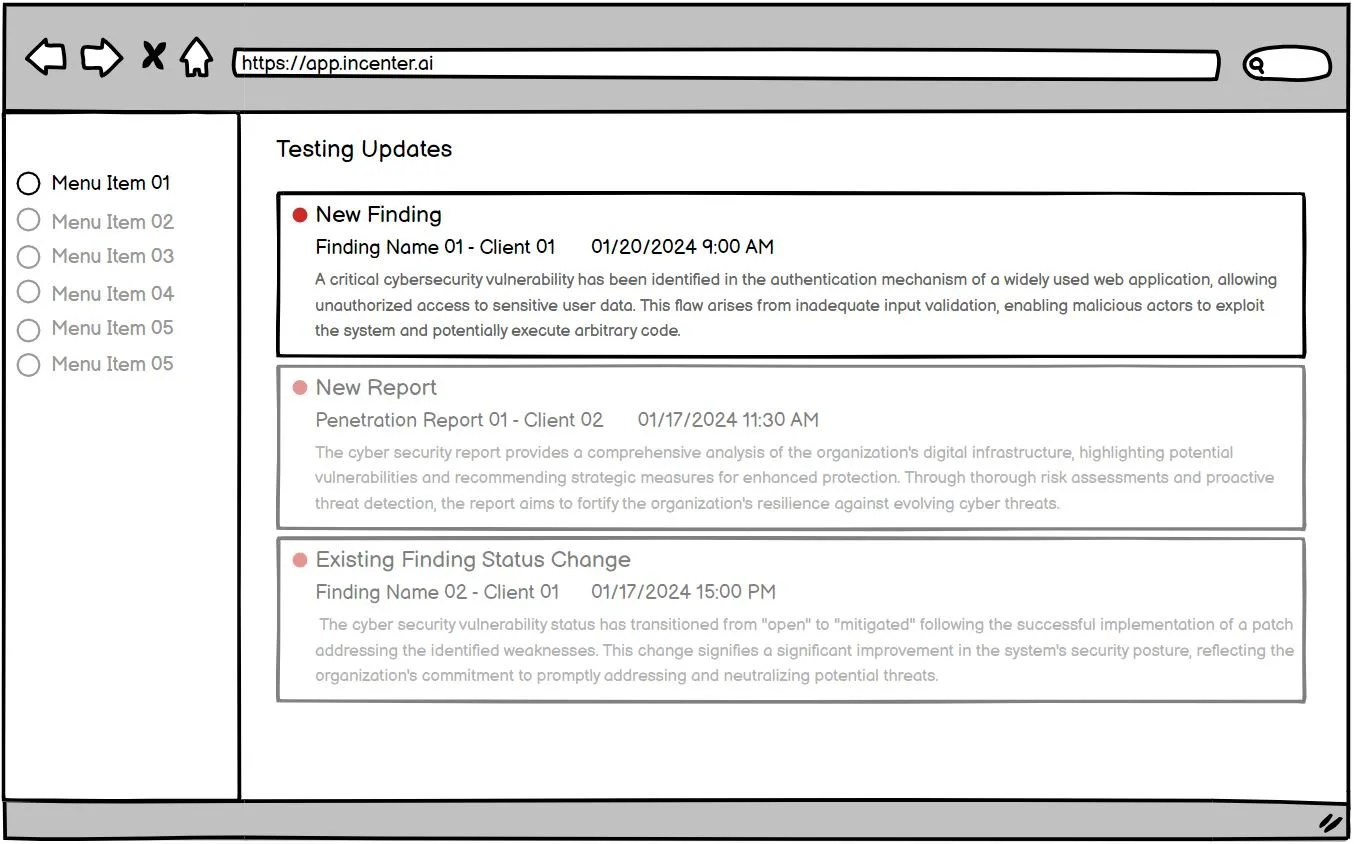
Examples of testing progress shared with clients
Problem Space
Clients struggle to access data related to security risks.
Because communication relies on emails, PDF reports, and phone calls, users can’t track real-time updates.

Executive-level Client User
Non-technical, busy decision-makers
Needs high-level, clear insights
Lack of real-time visibility into the high-level data of the security environment, delaying informed decision-making.
Engineer-level Client User
Technical, fixes security risks
Detail-oriented and data-driven
Lack of real-time access to risk details delays immediate fixes.
How to support two user groups with different needs?
Business pain points and needs
Enhance scalability by implementing automation within the business model.
Address staffing shortages by deploying an automated testing platform for penetration testers.
Develop the new platform to an advanced stage to attract investors and secure necessary funding.
Fast iterations
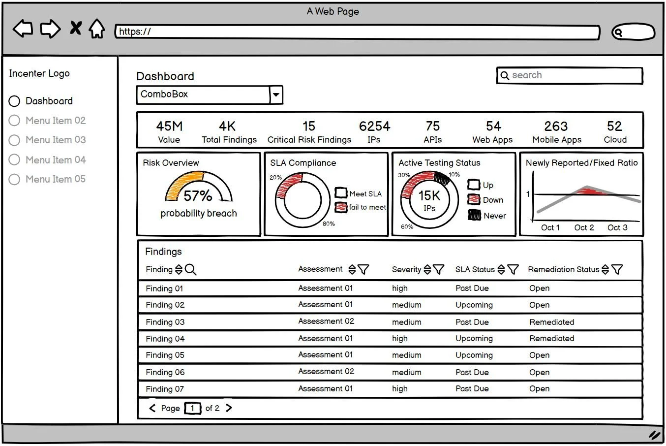
Initial iterations of presenting the test results
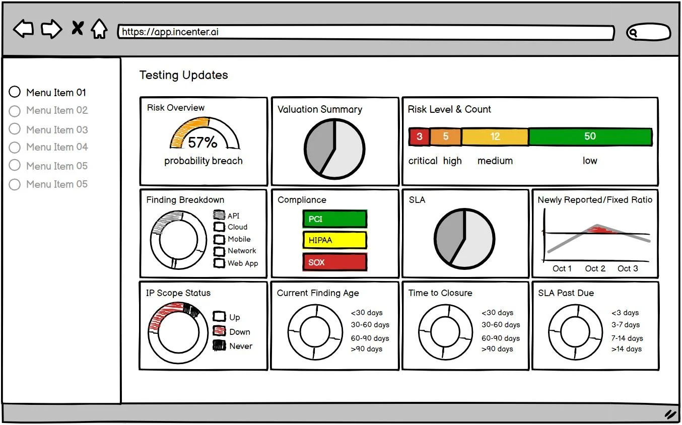
During brainstorming sessions, I investigate many methods for delivering testing results to users. These include options such as a "testing updates" table, a notification system, detailed reports, visualizations, filtering and search functionality, and an interactive dashboard. I found dashboards with key metrics and visuals best for giving users a quick overview and flexible access to details.
"Testing Updates" Table
Visualizations
Notification System
Filtering & Search Functionality
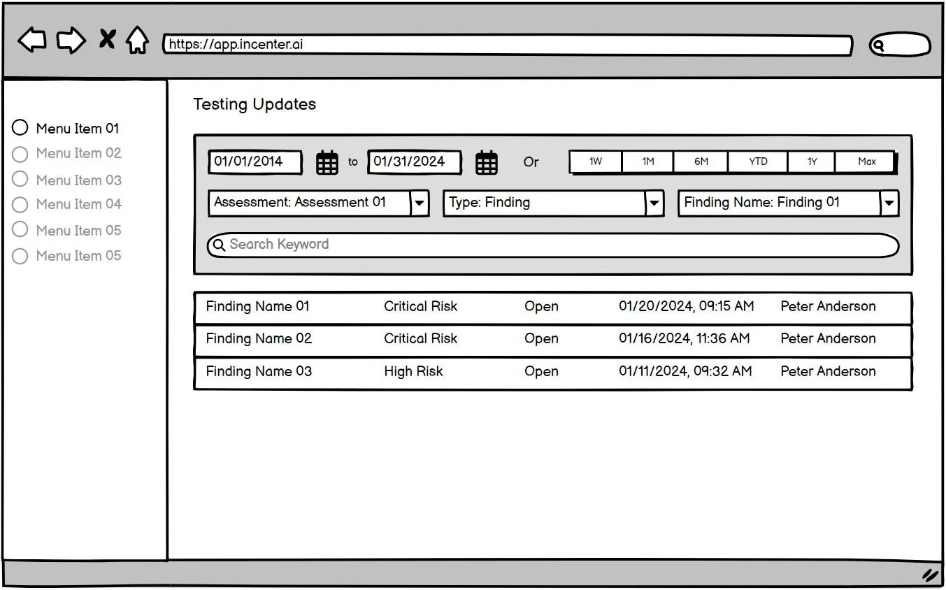
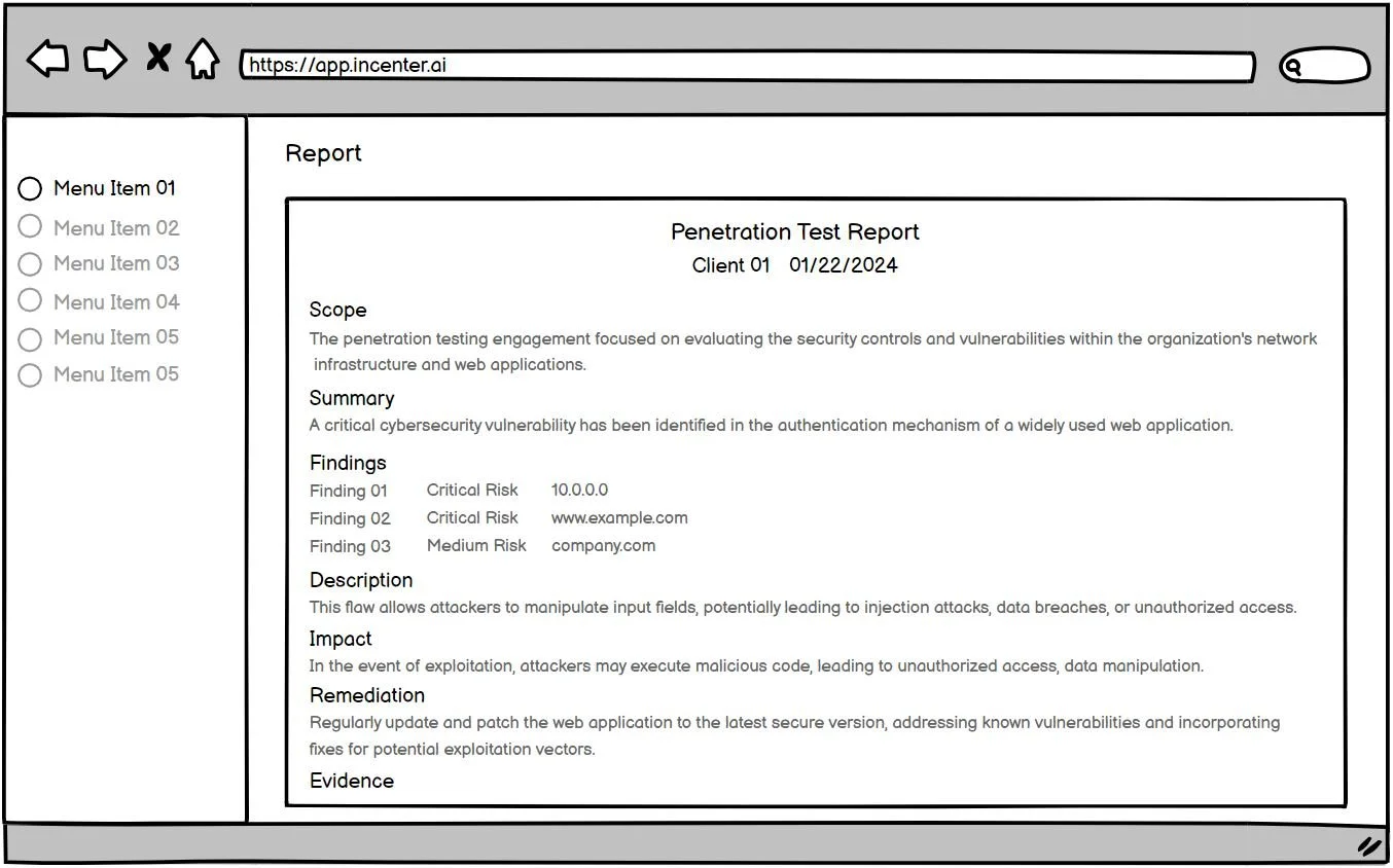
Detailed Reports
Interactive Dashboard
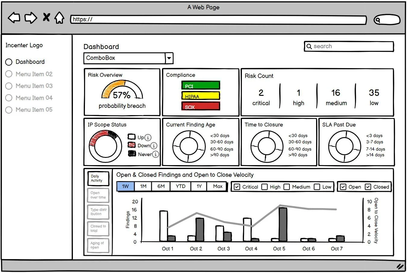
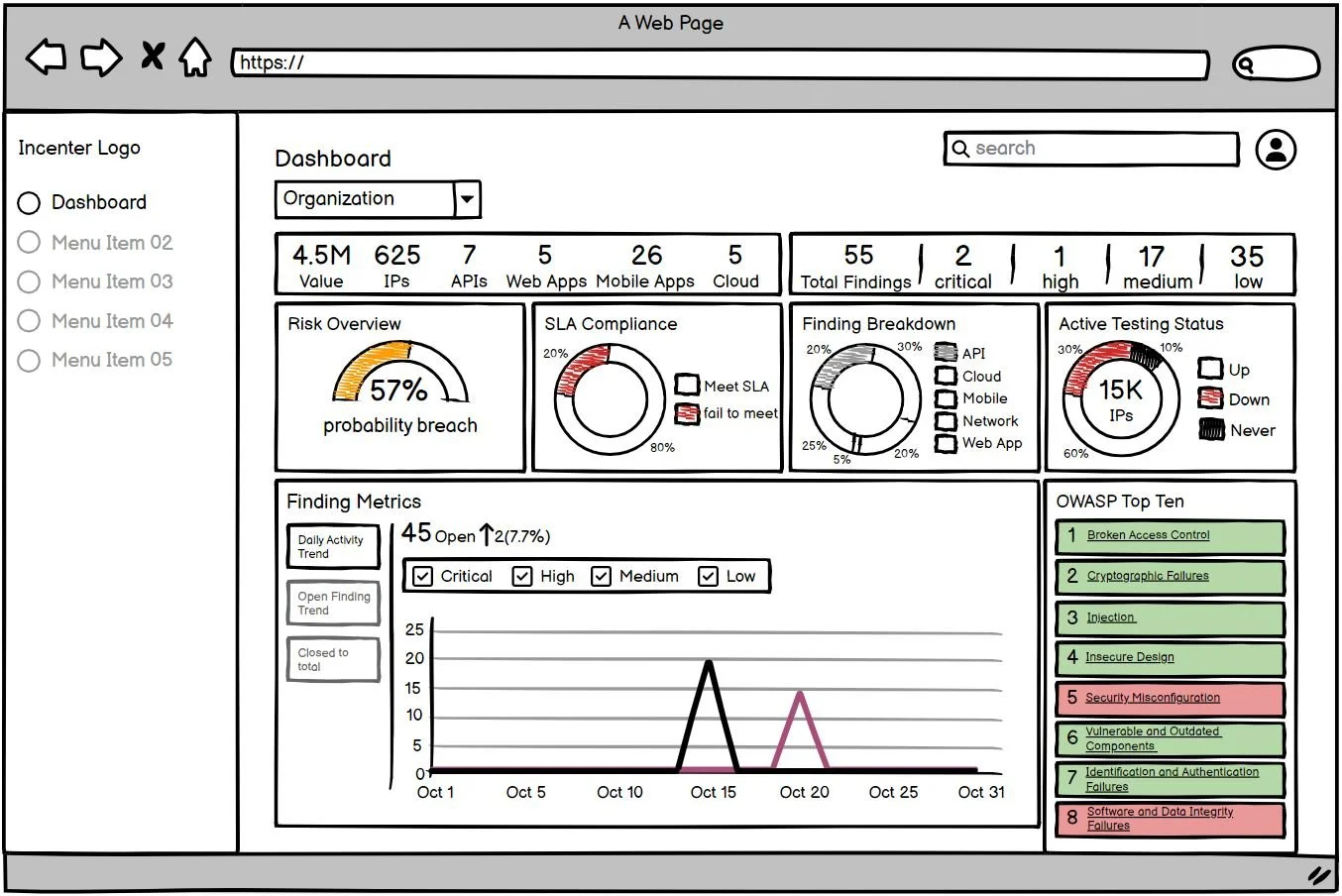
I explored separate dashboard for each user group and a shared dashboard for both user types. See below options.
After discussing scope with the dev team and stakeholders, we decided to launch with a single shared dashboard for the MVP to balance usability with our timeline and resources.
Dashboard for the Executive User
Dashboard for the Engineer User
Dashboard for the Executive & Engineer User
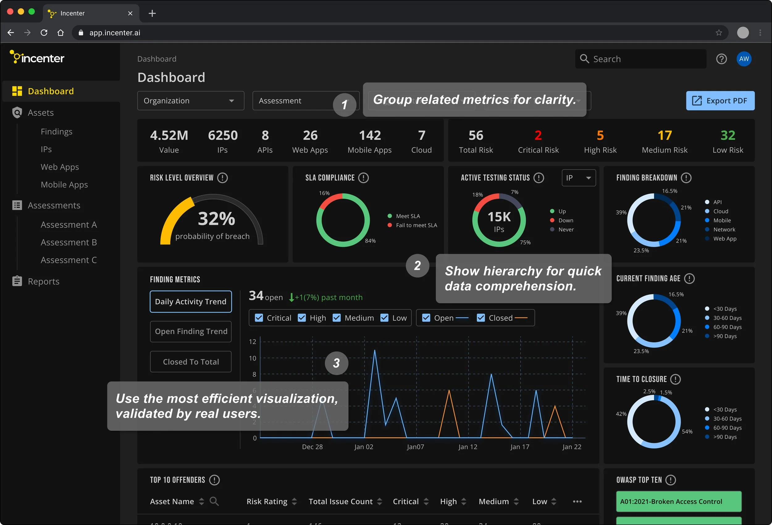
Design Decisions
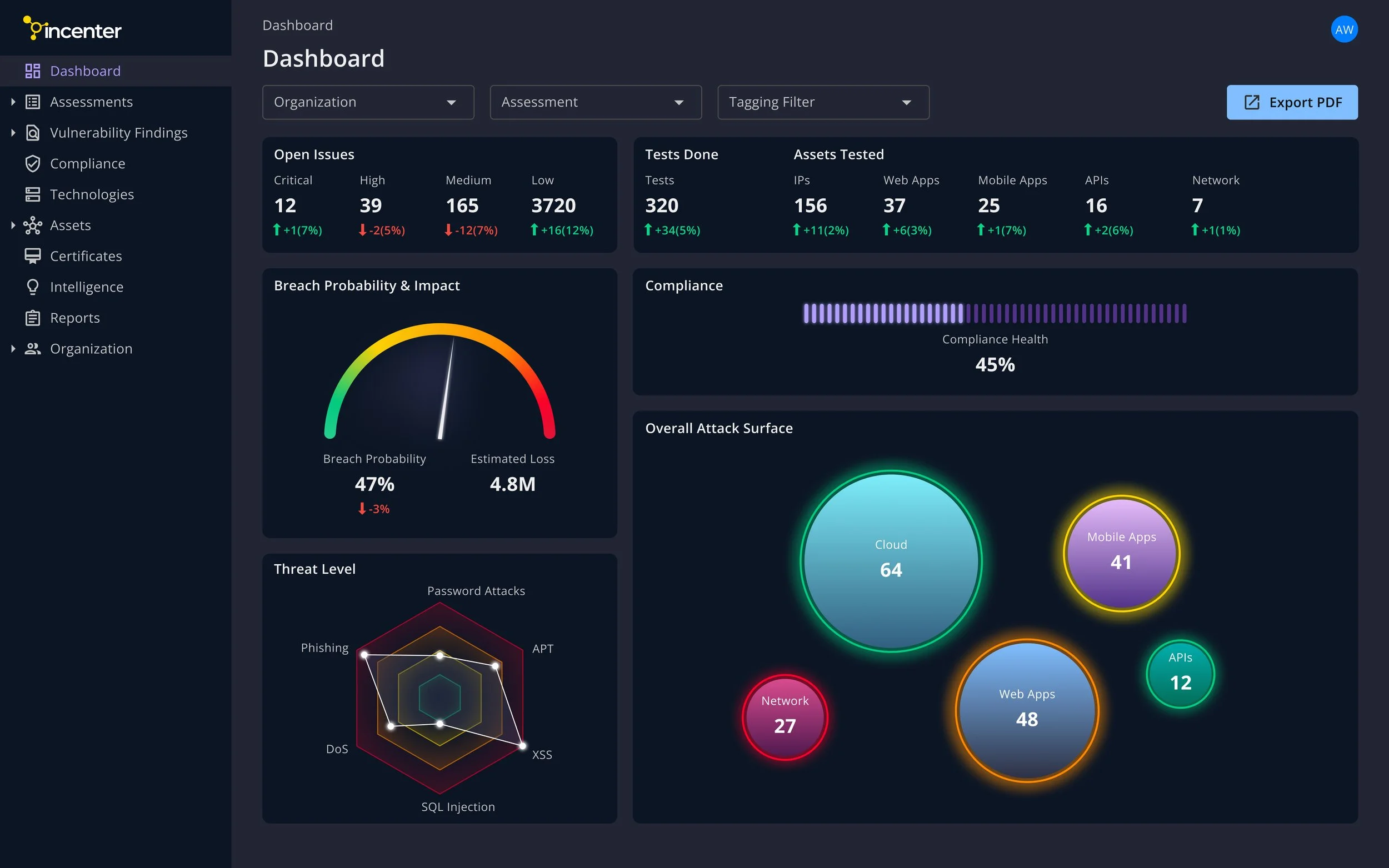
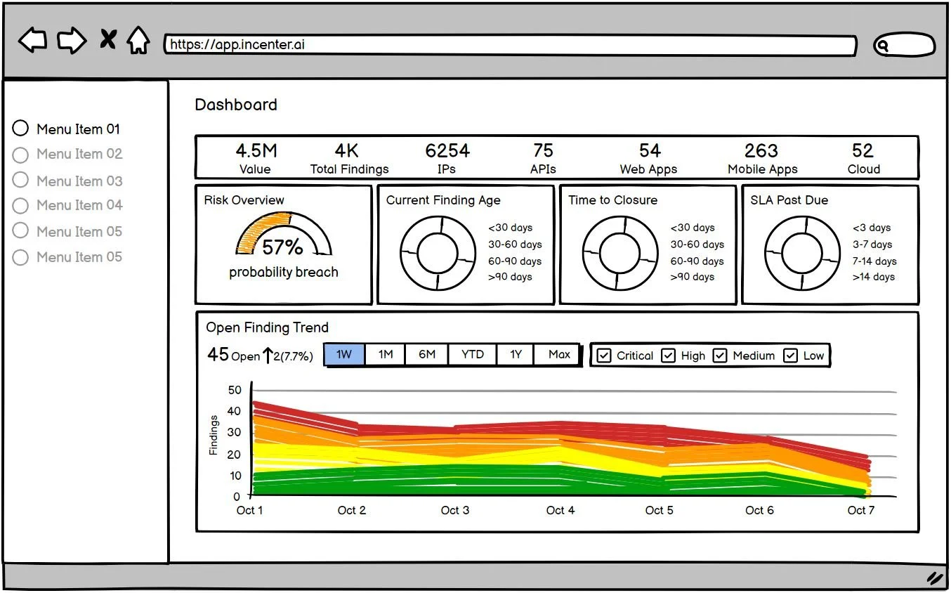
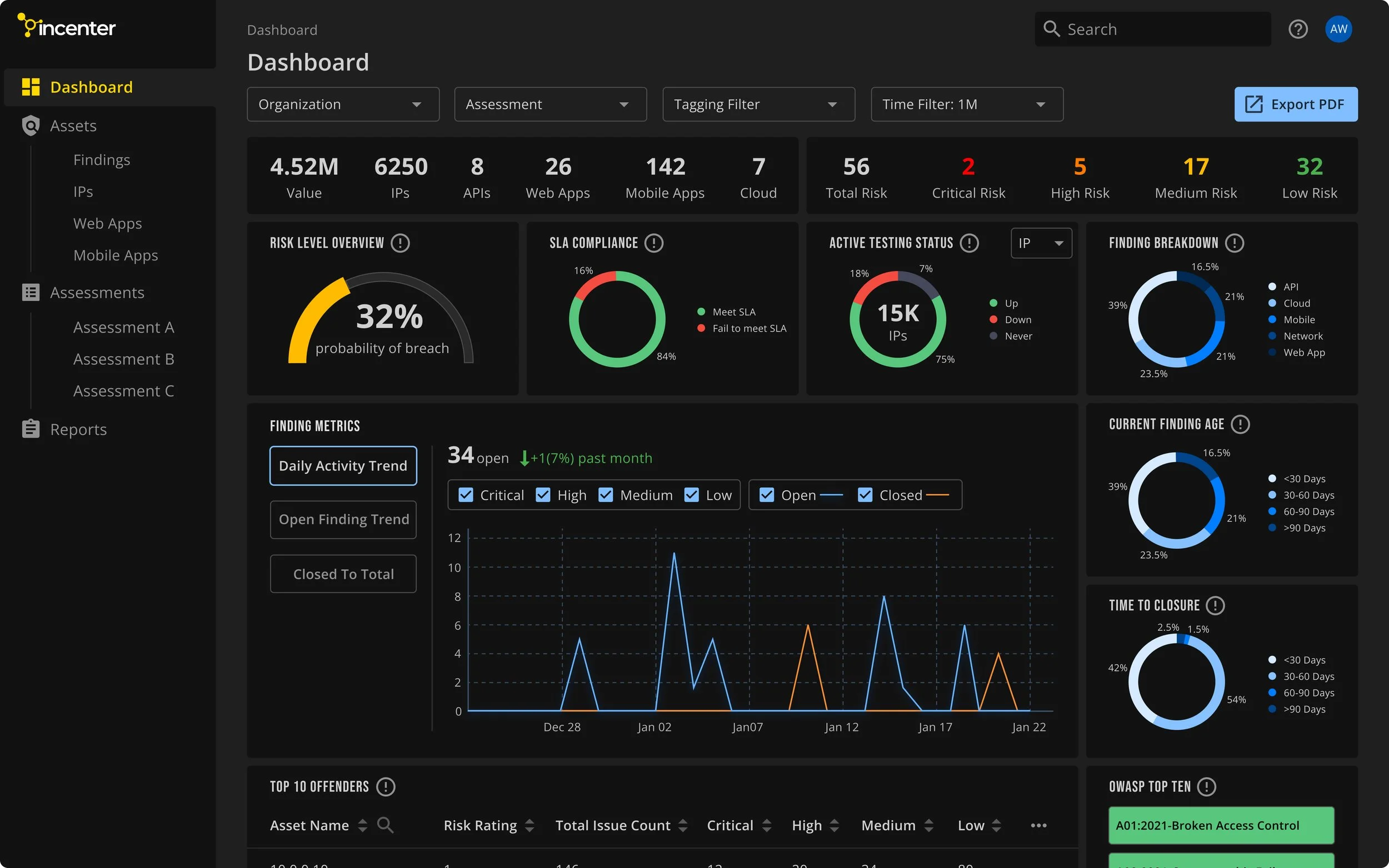
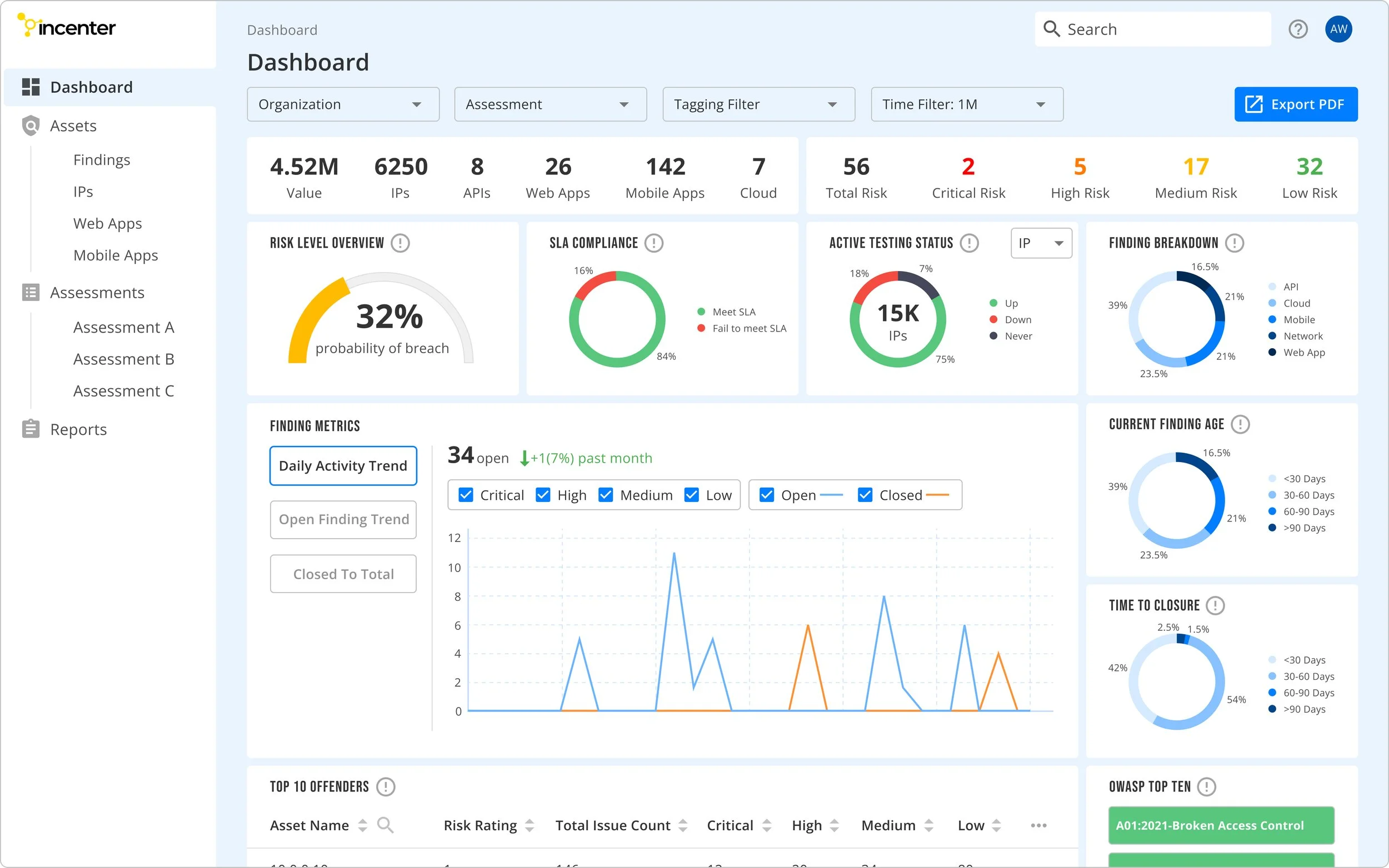
Dashboard Page
Provide a comprehensive view of the security landscape at a glance.
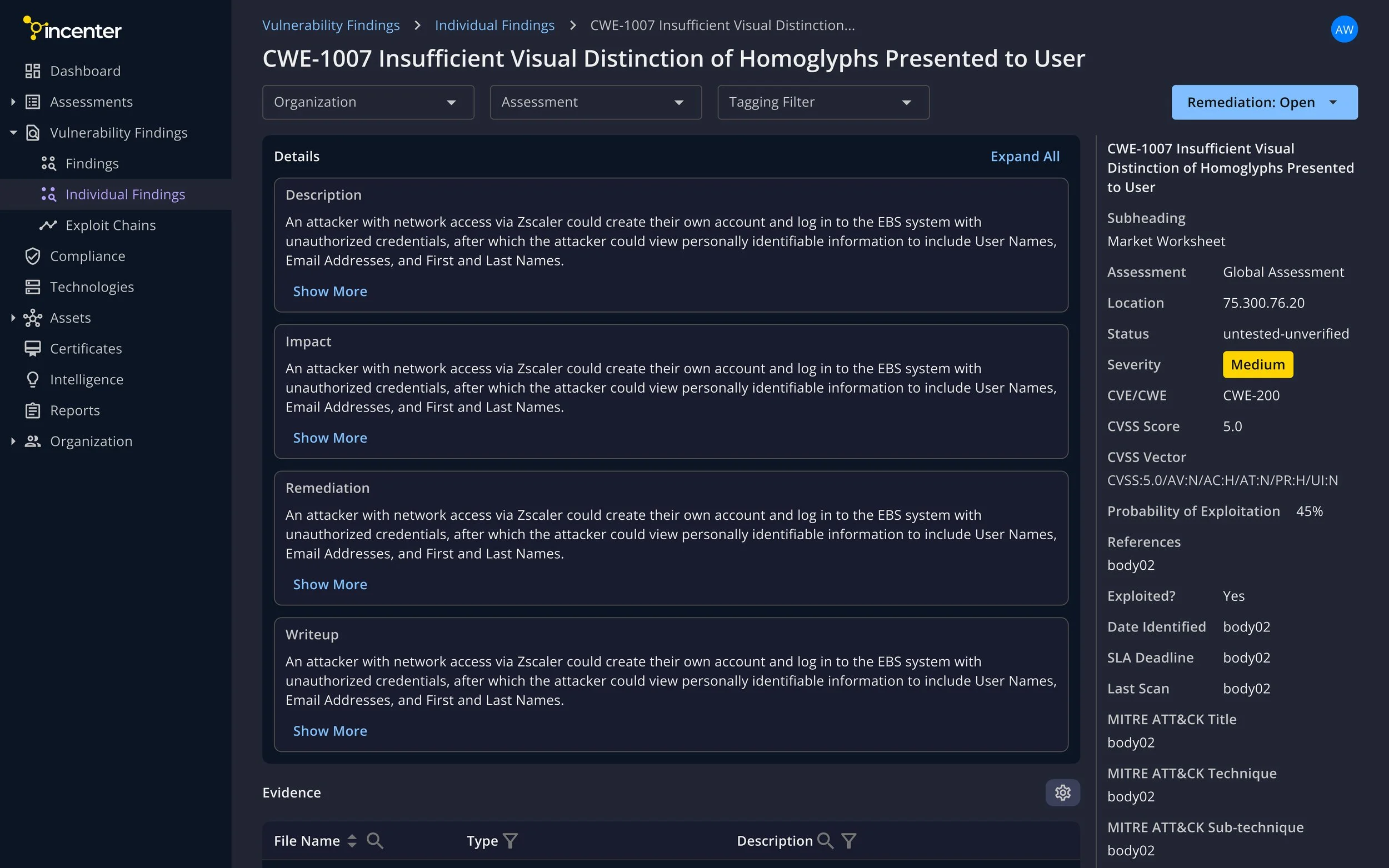
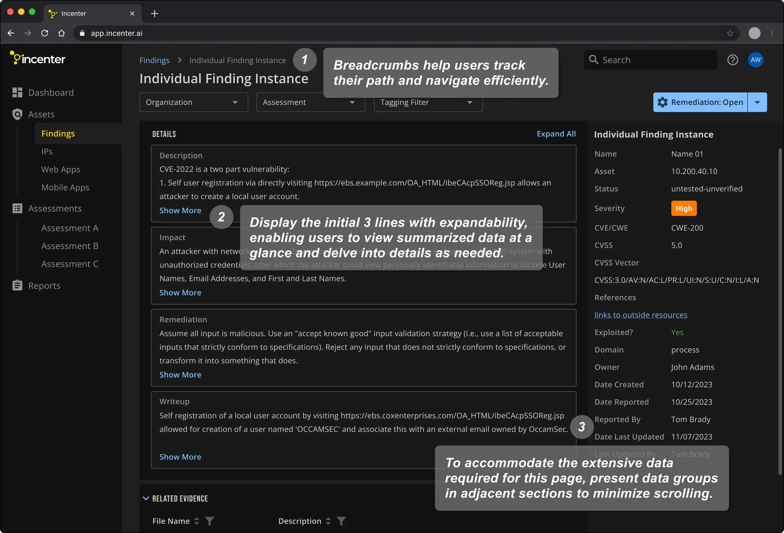
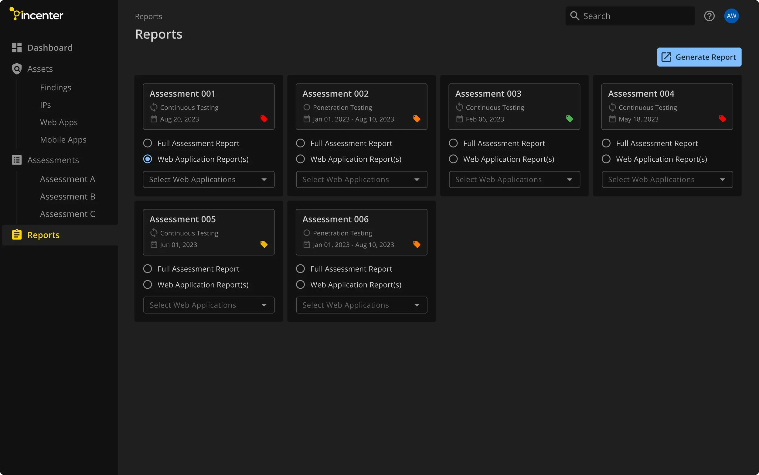
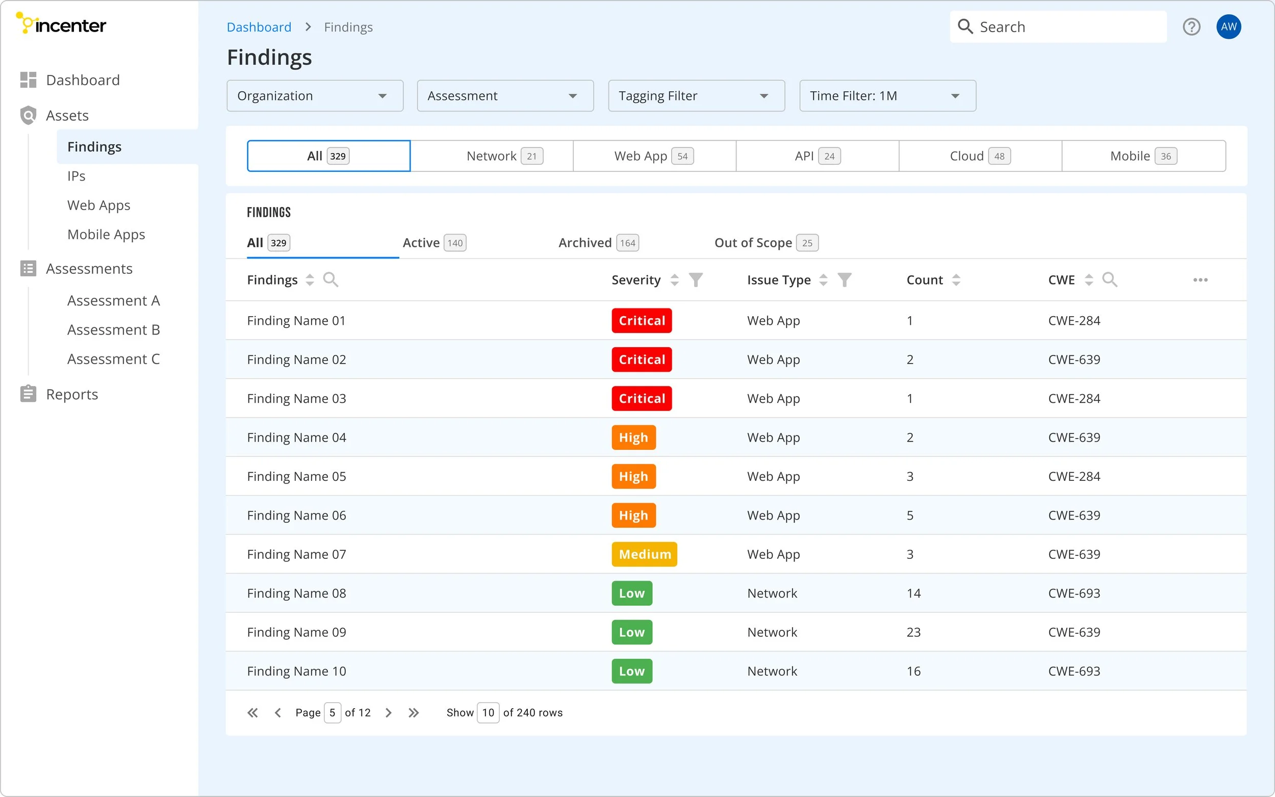
Finding Detail Page
The challenge with this page lies in its dense display of data and tables, resulting in a cluttered interface and extensive scrolling. To address this issue, I restructure the layout to enhance readability and minimize excessive scrolling for users.
Visual Style
I focus on integrating aesthetics and functionality through accessible color choices, improving overall design usability. Offering both dark and light modes caters to diverse user preferences, enhancing the user experience. User testing revealed a significant increase in satisfaction with the implementation of dark mode, aligning with our user preferences.
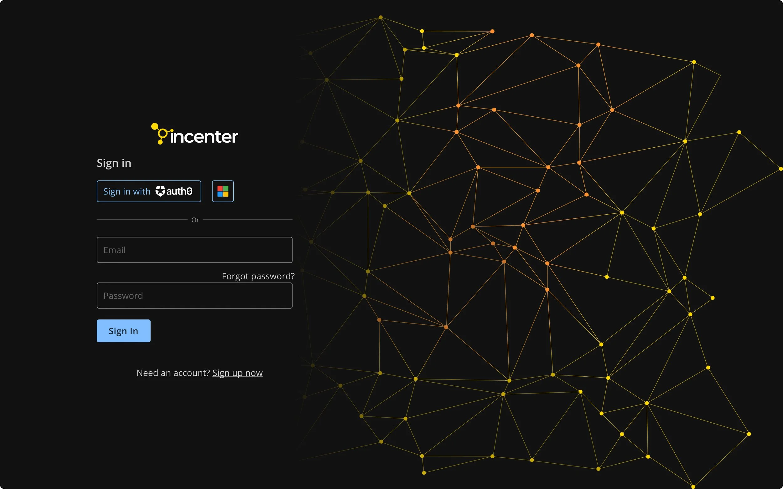
Sign In Page - Dark Mode
Dashboard Page - Dark Mode
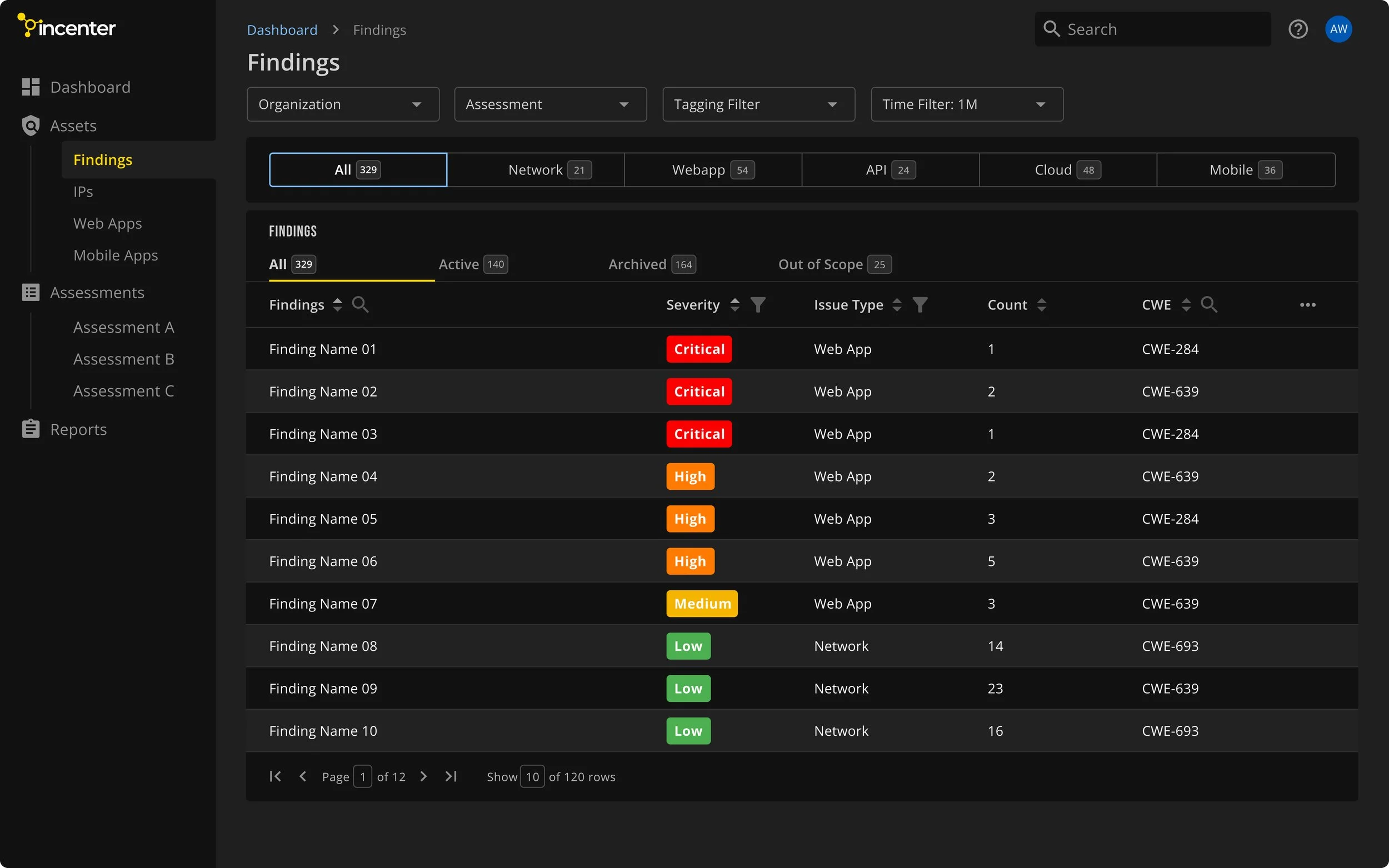
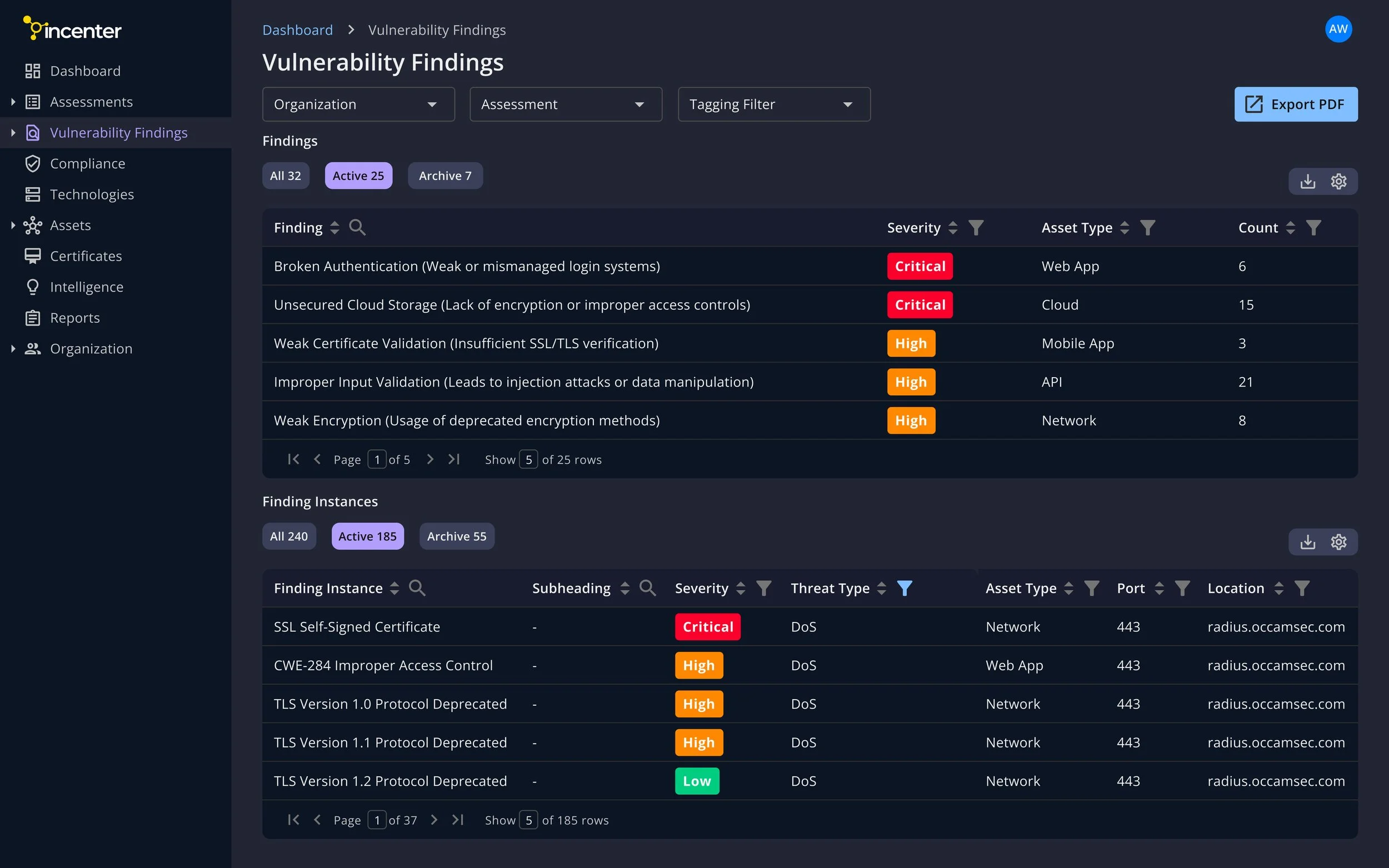
Findings Page - Dark Mode
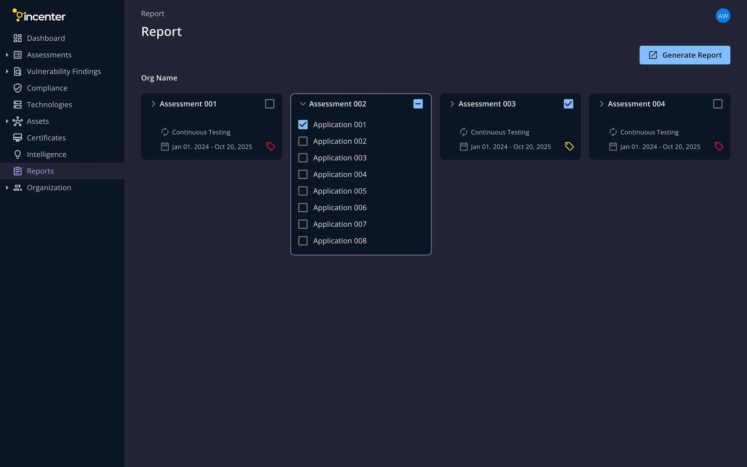
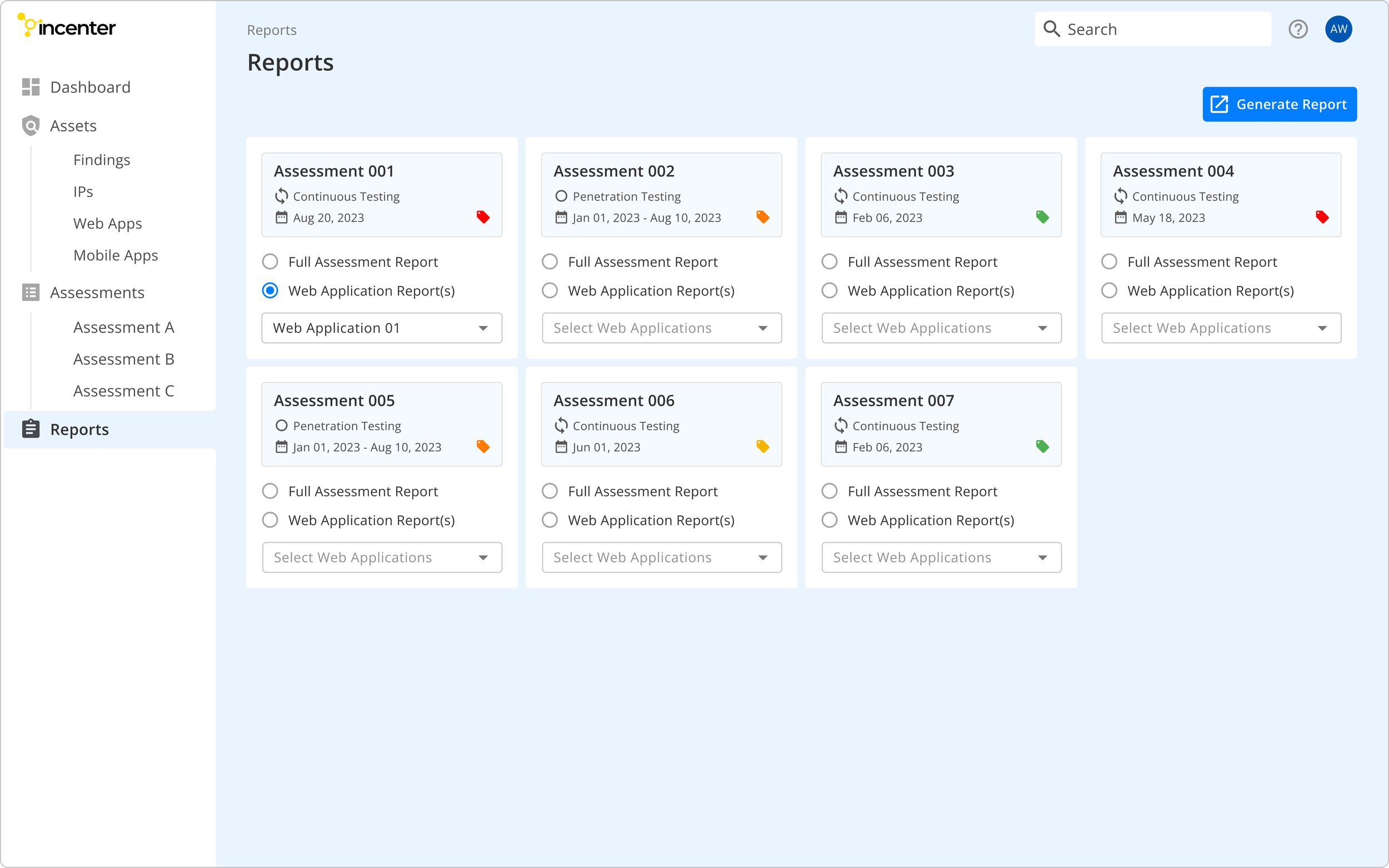
Reports Page - Dark Mode
Sign In Page - Light Mode
Dashboard Page - Light Mode
Findings Page - Light Mode
Reports Page - Light Mode
"Dark mode looks awesome! It makes all the difference for me.”
—— Satisfied Client A
“I love it when my favorite apps implement dark mode."
—— Satisfied Client B
Impact
After conducting two rounds of usability testing to optimize user flow and interface effectiveness, we successfully launched the MVP within the designated timeframe.
As a result:

70%
Increase in user base
62%
Increase in revenue
50%
Increase in conversion rate
UI Overhaul
After launching the MVP, we gathered extensive feedback from clients and stakeholders. This feedback helped us identify key problems to address in the Redesign process.
Executives:
The dashboard feels a bit crowded.
Some panels are not simple/clear enough.
“I also want graphics that better represent the attack surface and threat level.”
Engineers:
Tabs for selecting table content need to be emphasized.
It can be inconvenient when key features require extra clicks to access.
Based on the above feedback, here are the new designs:


We’re ready to launch the new design this month! We’re expecting:
Stronger market fit
Happier users
Better sales & retention